Interactive Portfolio System
IN BETWEEN
The project you’ve been inside all along: an adaptive portfolio shaped by identity, interaction, and parametric logic.
CONTEXT
You've already been inside this project for a while.
Unlike the others, IN BETWEEN is not only presented through the portfolio. It is the portfolio.
The challenge was to create a platform that could present very different projects clearly and give each one enough space to keep its own identity. The portfolio needed to feel coherent as a whole while also adapting to each project.
At the same time, the experience itself needed to communicate the kind of designer behind the work. Rather than simply describing my interest in interaction, systems, and computational thinking, the site became an opportunity to demonstrate those ideas through its structure, behaviour, and visual logic.
The goal was to build something expressive enough to stand out in a crowded portfolio landscape, but controlled enough that interaction never distracted from the projects it was designed to support.
The project began with a question:
How could a portfolio respond to each project while becoming a demonstration of the way I design?
INSIDE THE SYSTEM
The experience feels fluid and responsive.
The system behind it is built from rules, relationships, and carefully controlled behaviour.
01. Building the Visual Language
The particles became the foundation of the visual identity.
They represent individual elements that can connect, separate, and reorganise into different configurations, reflecting the way disciplines, technologies, processes, and people come together across my work. Throughout the site, the same system can form the logo, flow around content, react to the cursor, or reorganise into larger interactive structures.
This made the identity flexible by design. Rather than relying on a fixed composition, it could continuously transform while remaining recognisable.
Glassmorphism emerged through an exploration of current visual trends. It worked particularly well as a structured layer above the particles: transparent enough to preserve their movement, but controlled enough to keep text and project content clear.
The combination created a deliberate contrast.
The particles could remain dynamic, dense, and occasionally chaotic, while the glass surfaces introduced hierarchy, legibility, and order. One system brought movement. The other made that movement usable.
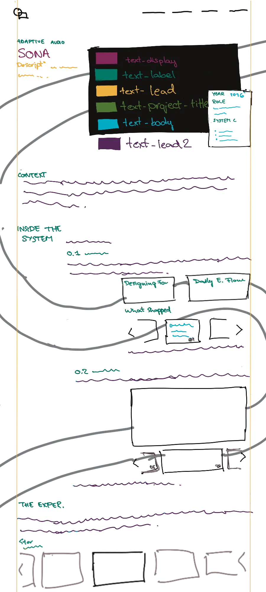
EARLY PROJECT PAGE STRUCTURE
02. From Parametric Thinking to Digital Behaviour
The particles were not arranged as a fixed visual composition. They were designed as a system.
My background in parametric design shaped the way I approached their behaviour. Rather than defining every outcome individually, I focused on the rules behind them: how particles are distributed, how colours are organised, how they follow curves, how they respond to movement, and how they shift between depth layers.
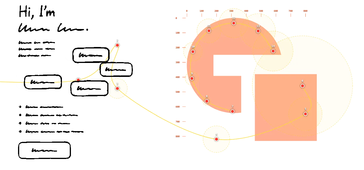
The particle garlands were developed through the same logic. Control points define their path, while parameters shape their thickness, turbulence, colour distribution, and position in space. This made it possible to design not only where they move across the screen, but also how they weave through the content itself.
The result is a visual system capable of producing many different configurations from the same underlying logic.
What changes is the form.
What remains consistent is the system behind it.
DESIGNING THE GARLAND ACROSS THREE DIMENSIONS
XY DEBUG MODE
Control points define the garland's path across the screen, allowing its curve, position, and relationship to the layout to be adjusted.
01
Z DEBUG MODE
Key points along the curve receive depth values, controlling where the garland moves behind, between, or in front of the content.
02
FINAL EXPERIENCE
The finished garland flows through the interface, responding to content, colour, depth, and interaction.
03
03. Designing an Adaptive Portfolio
The portfolio needed a strong identity of its own, but not one that would compete with the projects inside it.
Each project has a different palette, atmosphere, and visual language, so the system was designed to adapt around them rather than force them into a fixed frame. In the Work section, the cards remain neutral at first. As the user interacts with each project, its colours gradually take over the surrounding interface, transforming the particles, background, and overall atmosphere.
THE CHAMELEONIC EFFECT

The same principle continues across the project pages. The particle system adjusts to each project's palette and composition, while the glass structure remains consistent enough to preserve continuity throughout the site.
This balance allowed the portfolio to behave almost like a visual host: recognisable as one experience, but flexible enough to let every project feel like itself.
THE EXPERIENCE
The system was designed to stay visible without taking over.
Interaction gives the portfolio movement, personality, and depth, but the work still needs to remain easy to read and explore. Each section uses the same visual language differently, depending on what the user needs to understand, discover, or do.
The result is an experience that feels alive, while keeping the content in control.
01. Interaction as Navigation
The experience was designed to capture attention from the first moment and give users a reason to keep exploring.
The introduction unfolds gradually, building curiosity before leading into the work. From there, interaction becomes part of the navigation itself. Hovering over a project transforms the surrounding atmosphere, About reveals a longer narrative within the glass interface, and Collaborations turns the particles into something directly explorable.
Each section behaves differently, but the intention remains the same: to make the portfolio feel alive without making the work harder to understand.
Move through the site and let the interactions reveal the system.
02. Designing Through Code
The portfolio was designed and built as one continuous process.
Working with Claude Code allowed visual decisions, interaction logic, and technical implementation to evolve together. Rather than designing a static interface first and translating it later, I could test ideas directly in the site, adjust behaviour in context, and refine the system through repeated cycles of building, observing, and correcting.
Custom debug modes helped control the garlands across position and depth, while performance testing shaped how the particle system adapted across desktop, tablet, and mobile.
The code became part of the design process: a way to define relationships, test behaviour, and turn the visual system into something the user could actually experience.
Reflection
IN BETWEEN helped me understand that a portfolio can do more than present finished work. It can become part of the argument.
The project brought together several ways of working that had previously lived across different contexts: visual identity, interaction design, parametric thinking, storytelling, and development. Translating parametric logic from physical and computational design into a digital experience was especially important. Instead of defining a single visual outcome, I was designing the rules that allowed the system to keep changing while remaining coherent.
It also reinforced that interaction is most effective when it supports meaning. The particles, transitions, and responsive behaviours were not added simply to make the site feel more dynamic. They were designed to express the same ideas present throughout the portfolio: systems, relationships, adaptability, and the spaces between disciplines.
Building the site through code changed the role of prototyping as well. Design and implementation became one continuous process, where visual decisions could be tested, adjusted, and experienced directly rather than handed off as static instructions.
More than a container for the projects, IN BETWEEN became a working example of the kind of design practice it was created to present.
A system designed to keep changing, without losing its identity.