ADAPTIVE AUDIO EXPERIENCE
SONA
Supporting nurses’ emotional recovery through an AI-guided commuting experience.
CONTEXT
SONA was developed as an academic project during my Master of Interaction Design at the University of Technology Sydney, exploring how music, AI, and lightweight interaction could support emotional recovery in everyday routines.
The project focused on nurses, whose days are shaped by care for others, long shifts, emotional demands, commuting, and family responsibilities. Finding time to intentionally care for themselves is often much harder.
Instead of designing another wellbeing app that asked users for more time, attention, or discipline, the project began with a different question:
How might emotional recovery fit into an existing routine, without asking users for more time, attention, or effort?
Understanding that question meant looking beyond the screen and into the behaviours, constraints, and transitional moments already present in nurses' daily lives.
INSIDE THE SYSTEM
The experience is intentionally simple.
The system behind it isn't.
01. Understanding the User
Before designing the experience, I needed to understand the conditions surrounding nurses' daily routines. These behaviours, constraints, and existing habits became the foundations of the system.
DESIGNING FOR
Nurses in Daily Care Settings
- Long shifts
- High cognitive load
- Daily public transport commuting
- Limited personal time
- Music as emotional regulation
DAILY EMOTIONAL FLOW

WHAT SHAPED THE SYSTEM
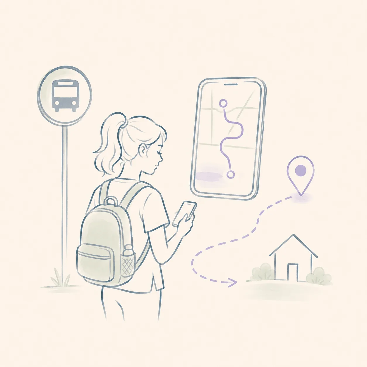
Navigation was already part of the routine.
Participants frequently relied on navigation apps, even on familiar routes. Navigation wasn't an additional feature to introduce; it was already an essential part of their commute.
01
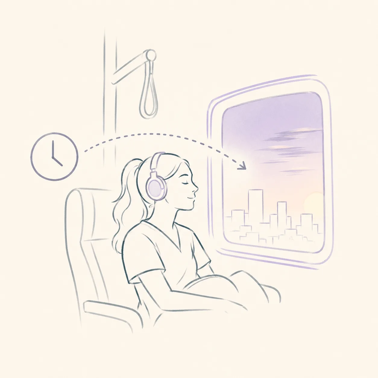
Commuting created uninterrupted recovery time.
Without access to a car, participants spent long periods commuting on public transport, creating one of the few moments in the day that belonged entirely to them.
02
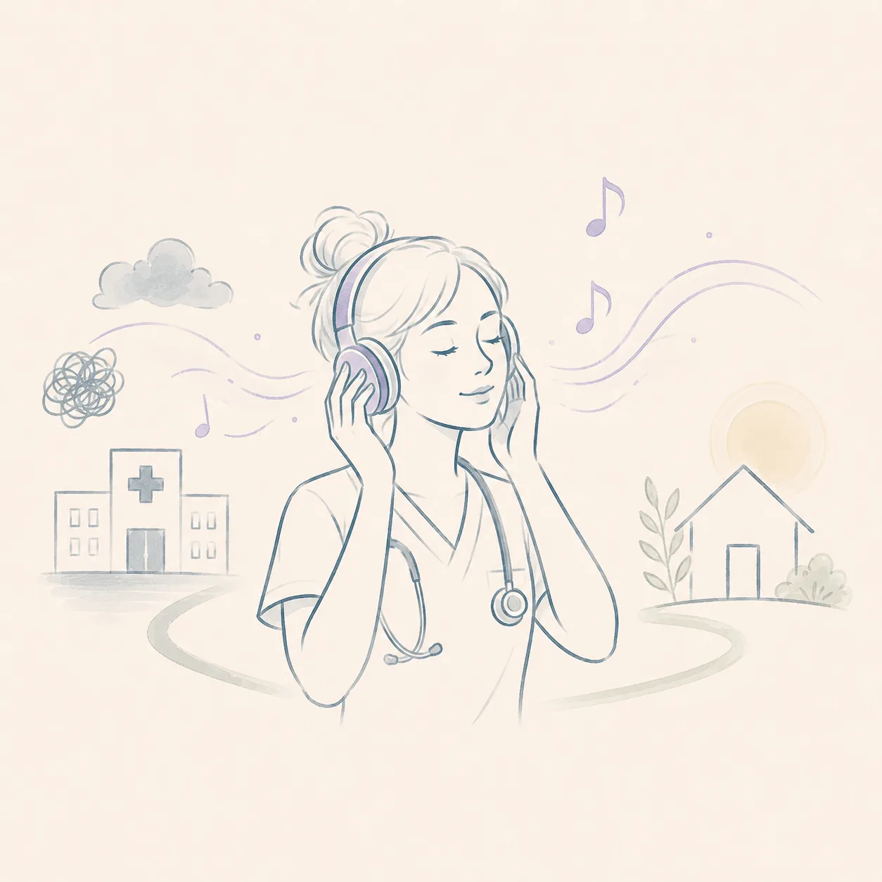
Music supported emotional transition.
Participants consistently described music as a way to disconnect from work and mentally prepare for home.
03
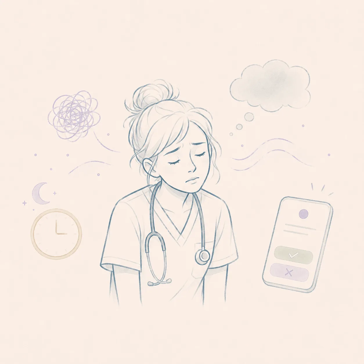
Cognitive capacity was already exhausted.
After demanding shifts, any interaction needed to remain lightweight, unobtrusive, and easy to engage with or ignore.
04
These observations became the foundation for the system architecture.
02. System Architecture
The challenge wasn't designing individual features, it was designing how they worked together.
SONA was conceived as an ecosystem rather than a standalone application. Navigation, emotional check-ins, adaptive audio, and AI guidance work as interconnected components, allowing the experience to continuously adapt throughout the journey.
SYSTEM BLUEPRINT
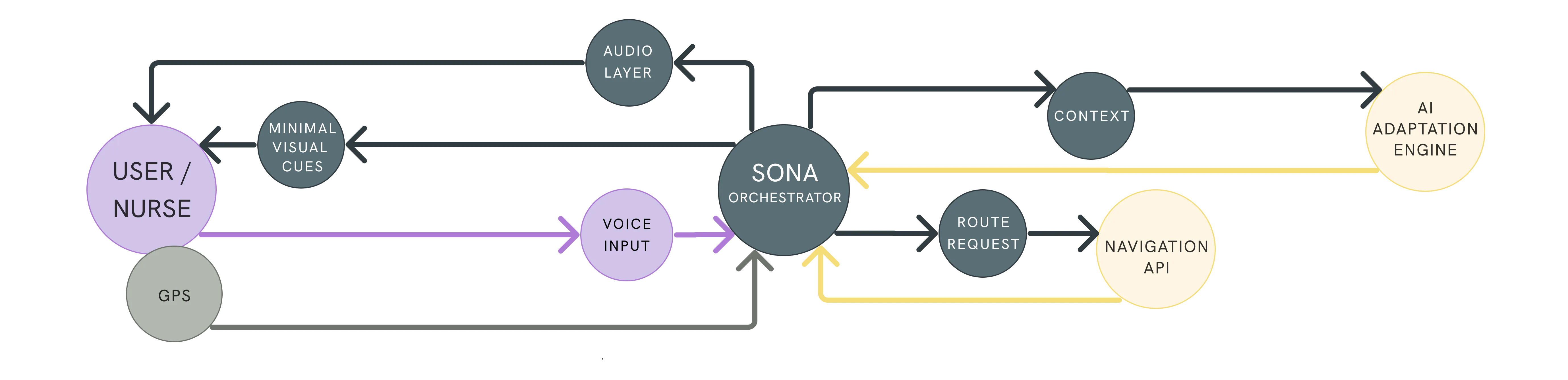
FROM INPUT TO EXPERIENCE
The full blueprint shows how SONA turns lightweight inputs into a continuous journey.
What begins as a destination, a route, a mood response, or a location update becomes adaptive sound, voice guidance, and navigation support.
Use the side cards to follow the journey from input to output.
00
CONTEXT AS AN INPUT
The experience begins by understanding the user's context rather than asking them to configure the system.
A short emotional check-in, destination, and commuting conditions provide enough information for the experience to adapt while keeping interactions minimal.
01
ORCHESTRATED, NOT AUTOMATED
Rather than relying on a single AI feature, the system continuously coordinates multiple components working together.
Navigation, adaptive audio, and voice interaction respond to changing conditions throughout the journey, creating an experience that feels continuous rather than fragmented.
02
INVISIBLE BY DESIGN
The success of the experience wasn't measured by how often users interacted with it. It was measured by how little they needed to.
Every interaction was intentionally lightweight, allowing the system to support the journey without becoming another source of cognitive load.
03
Technology disappears when the system works.
THE EXPERIENCE
Designing the system was only part of the challenge.
The experience also needed to feel calm, intuitive, and almost invisible. Every interaction was designed to support emotional recovery without interrupting the journey, allowing technology to fade into the background while the experience remained human.
Before moving into the interface, I mapped the experience as a journey through one specific transition: the way home after a demanding shift.
STORYBOARD
A post-shift commute transformed into a guided emotional transition.

The shift ends, but the weight of the day remains.
01

Before heading home, the nurse opens SONA.
02
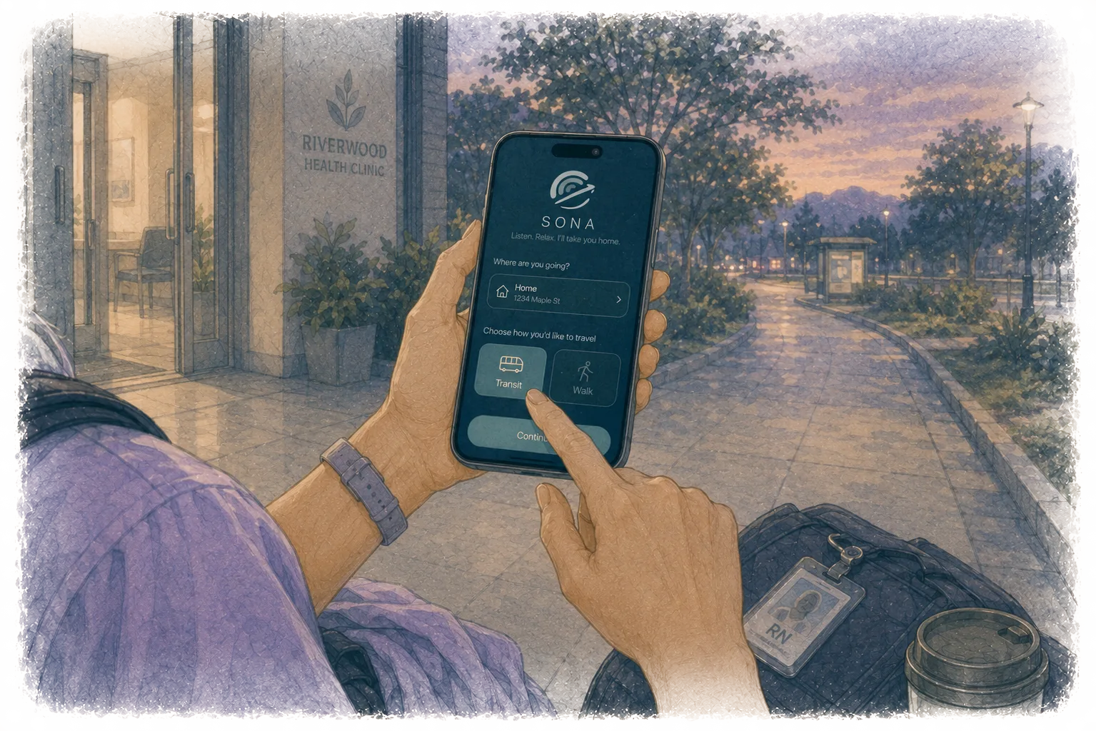
SONA asks for a destination and travel mode.
03

The experience shifts from screen to sound.
04
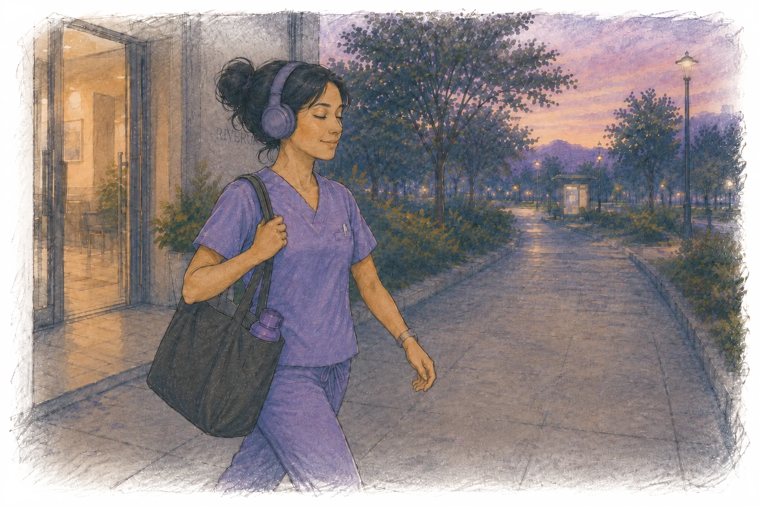
A short emotional check-in helps SONA understand how the day felt.
05
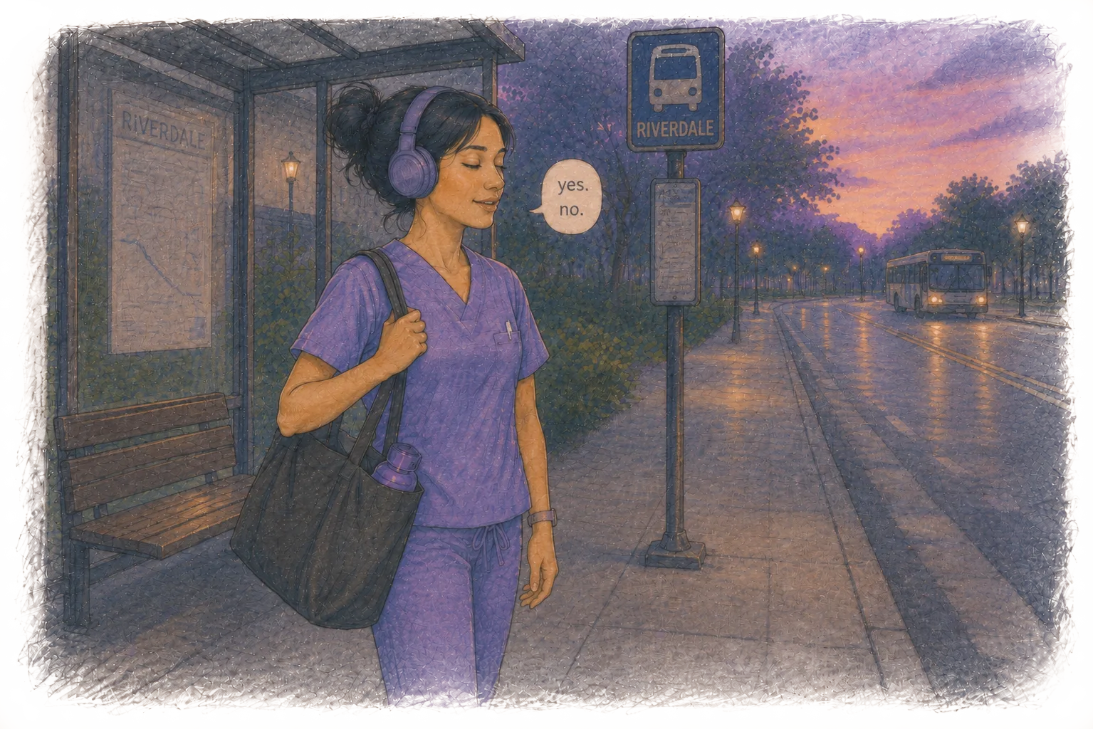
She responds with simple answers while continuing to move.
06
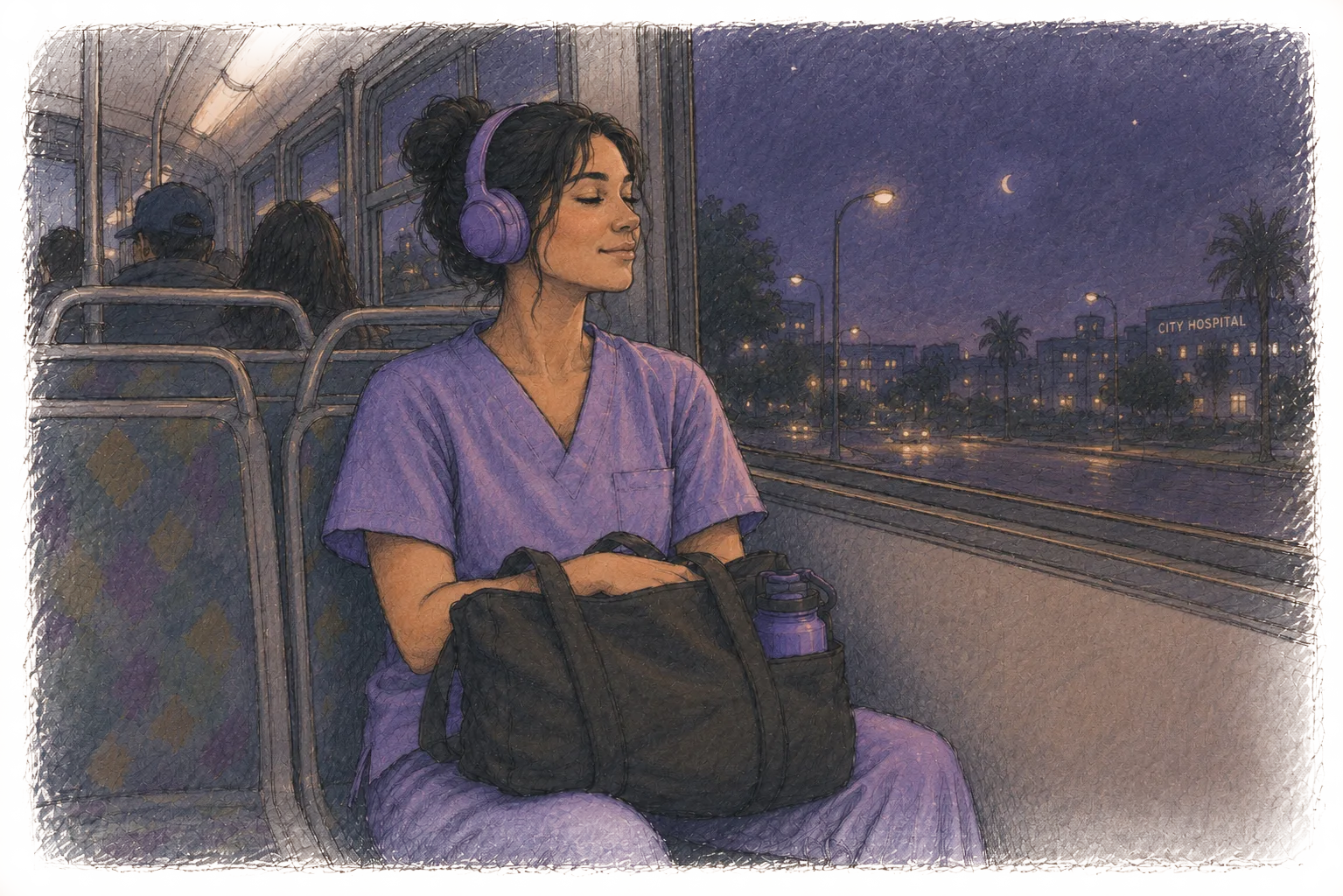
Adaptive audio begins to shape the transition home.
07
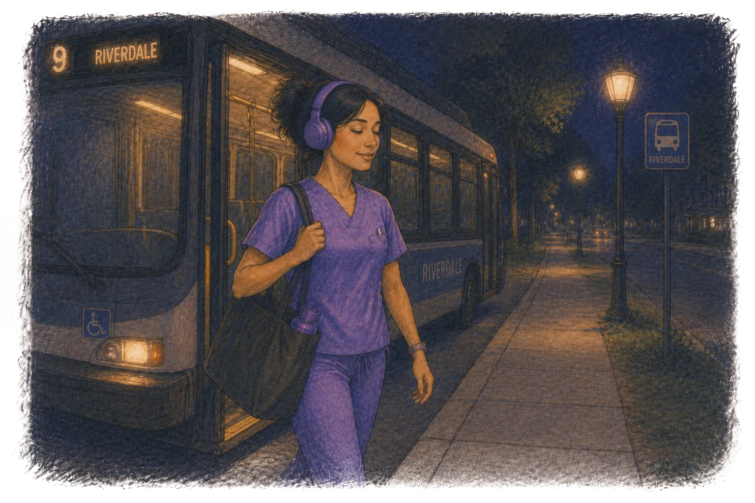
Voice, sound, and navigation adjust quietly along the way.
08

She arrives home with a little more space between work and herself.
09
The storyboard helped define the rhythm of the experience.
Rather than treating each screen as an isolated step, it revealed how SONA needed to behave across time: when to speak, when to stay quiet, when to guide, when to check in, and when to let the user simply move through the journey.
This became the foundation for the interface design.
01. Designing the Interface
SONA's interface was designed to stay quiet.
Because the experience is primarily auditory, the visual layer needed to support orientation, trust, and control without asking for continuous attention. The interface acts less like a traditional app and more like a lightweight control surface for a sound-led journey.
Rather than encouraging users to browse, scroll, or manage multiple settings, the flow is reduced to a few essential moments: choosing a destination, confirming a route, responding to short emotional check-ins, and receiving occasional navigation updates.
The goal was not to keep users engaged with the screen.
The goal was to help them stop needing it.
Sound, Direction, and Trust

Interface Flow
The prototype follows the journey home through a sequence of low-effort interactions:
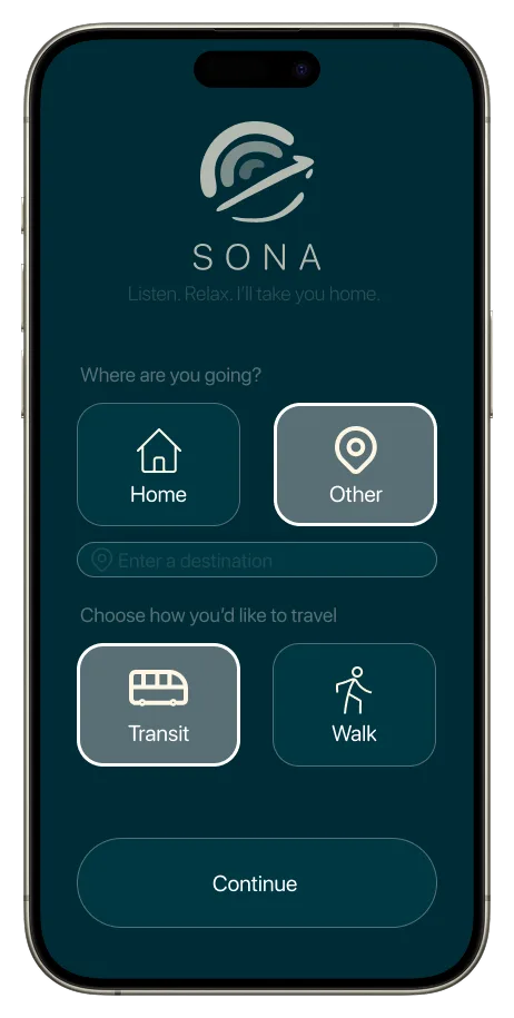
Route Setup
The user selects a destination and travel mode, allowing the system to understand the journey without requiring detailed configuration.
01
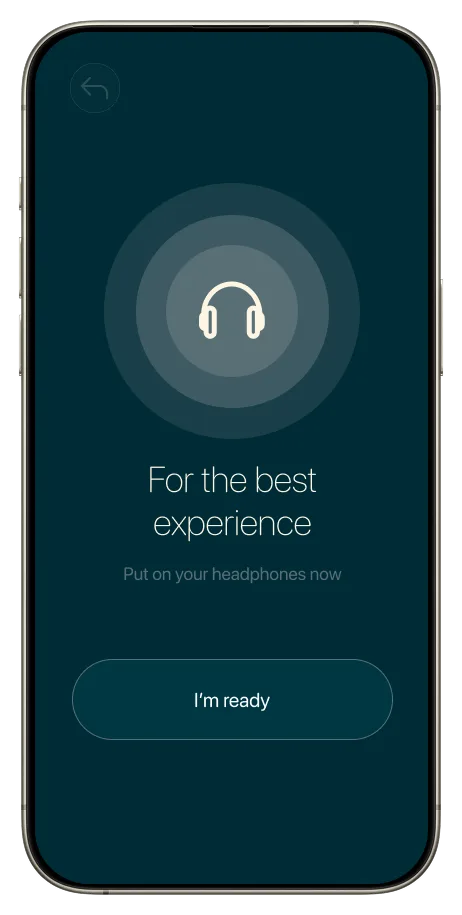
Audio Onboarding
A headphone prompt and short introduction prepare the user for a sound-led experience, establishing trust before the journey begins.
02
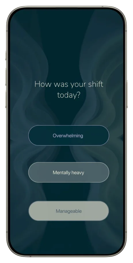
Emotional Check-ins
Short prompts allow the system to understand the user's emotional state through simple responses, reducing the need for complex reflection.
03
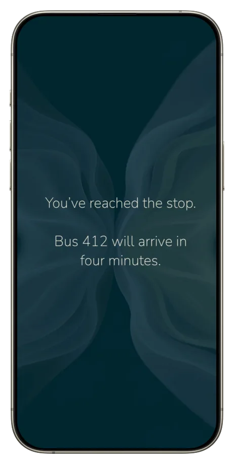
Navigation Guidance
Directions are embedded into the audio experience, allowing users to stay oriented without constantly checking their phone.
04
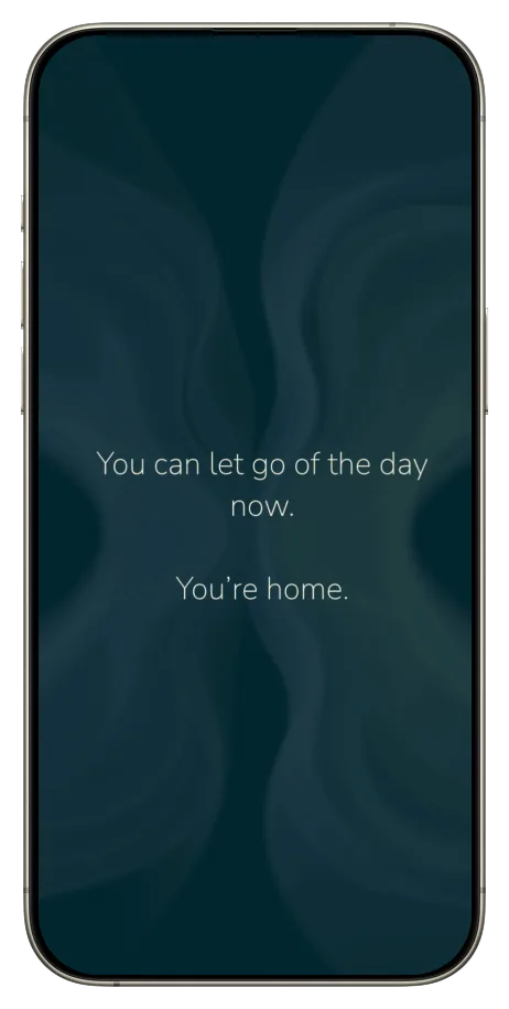
Arrival Transition
The experience ends with a calm closing moment, helping the user re-enter home life with more presence and less emotional residue from work.
05
02. Sound-Led Interaction
SONA is not designed around screen time.
It is designed around attention.
The main interaction layer is sound: ambient audio, guided voice, subtle navigation cues, and short emotional prompts. These elements work together to create a continuous experience that responds to the user's journey without fragmenting it into separate tasks.
Instead of asking users to pause, reflect, type, or track their mood manually, SONA uses brief voice-based interactions that can be answered while walking, waiting, or sitting on public transport.
The sound experience adapts gradually throughout the commute. Emotional responses influence the tone, rhythm, density, and pacing of the audio, while navigation cues are introduced only when needed.
This creates a different kind of interface: one that is felt more than operated.
03. Emotional Language
Not every feeling can be explained on a bus.
SONA was designed for a public journey, where emotional recovery happens in the middle of streets, stations, headphones, strangers, and movement. In that context, asking users to describe their emotional state too directly could feel exposed, clinical, or mentally demanding.
The emotional language was designed to lower that barrier.
Rather than asking users to explain themselves, SONA uses simple words like Ocean, Mist, Sage, Sand, and Lavender. These words act as emotional shortcuts: soft enough to say in public, specific enough for the system to respond to.
Each state is connected to both a color and a sound quality.
Ocean
Suggests depth and intensity.
01
Mist
Suggests fogginess and mental heaviness.
02
Sage
Suggests steadiness and balance.
03
Sand
Suggests warmth, grounding, and rest.
04
Lavender
Suggests softness and low energy.
05
Together, these words create a language that feels less like reporting a mood and more like choosing a texture.
Color, sound, and language become one system.
A way for the user to say:
this is where I am right now
without having to explain why.
04. Bringing the Journey Together
The final prototype brings the system into one continuous journey home.
It begins with a familiar interaction: choosing a route. But as the journey unfolds, the screen becomes less central. The user is gradually guided away from visual attention and into a sound-led experience shaped by voice, navigation, emotional check-ins, and adaptive audio.
The user does not need to manage the system.
They only need to move through the journey.
SONA checks in briefly, offers direction when needed, softens the rhythm of the experience, and creates small moments of recovery inside an ordinary commute.
The prototype was designed to communicate not only what SONA does, but how it feels to be supported by a system that reduces effort instead of asking for more of it.
Prototype
Listen. Relax. I'll take you home.
Prototype
Best experienced in the Figma app or on desktop.
By the end, the commute is no longer treated as lost time. It becomes a transitional space: a moment between care for others and care for oneself.
That shift is the core of SONA.
Reflection
SONA helped me understand that meaningful interaction design is not always about adding more interaction.
Sometimes, the most valuable design decision is knowing what to remove.
As an academic project, SONA created space to explore a concept that sits between UX research, AI, sound, and emotional experience design. But the most important shift came from the research itself.
The project began as an exploration of music and wellbeing, but the research pointed toward a more specific opportunity: supporting emotional recovery inside a routine nurses were already living through.
That shift was important. Instead of designing a separate wellbeing tool that required extra time, attention, or discipline, SONA became a system designed to fit within an existing behaviour: commuting home while listening to music.
The project also challenged me to think about AI less as a feature and more as an orchestration layer. In SONA, AI is not the visible centre of the experience.
If developed further, I would focus on testing the emotional pacing of the experience with nurses in real commuting contexts. I would want to understand how often the system should speak, when silence is more valuable than guidance, how much adaptation feels helpful before it becomes intrusive, and how sound, voice, navigation, and timing can work together without overwhelming the user.
For me, SONA represents the kind of design work I am most interested in: systems that are technically complex, emotionally sensitive, and simple enough to disappear when they are working well.