TEXTILE & BRAND IDENTITY SYSTEM
AÎNÉES
Building a complete fashion identity system across textiles, garments, photography, and digital presence.
CONTEXT
AÎNÉES was built as a complete fashion identity system.
The project brought together garments, textiles, labels, packaging, photography, website, and customer experience into one connected brand world. Each touchpoint had a different role, but all of them needed to feel coherent, emotionally specific, and commercially real.
The challenge was not only to design beautiful pieces.
It was to create a visual and material language that could move across fabric, body, image, and digital space without losing its identity.
At the center of that system was a simple question:
How can a fashion brand feel personal, expressive, and contemporary while staying coherent across every touchpoint?
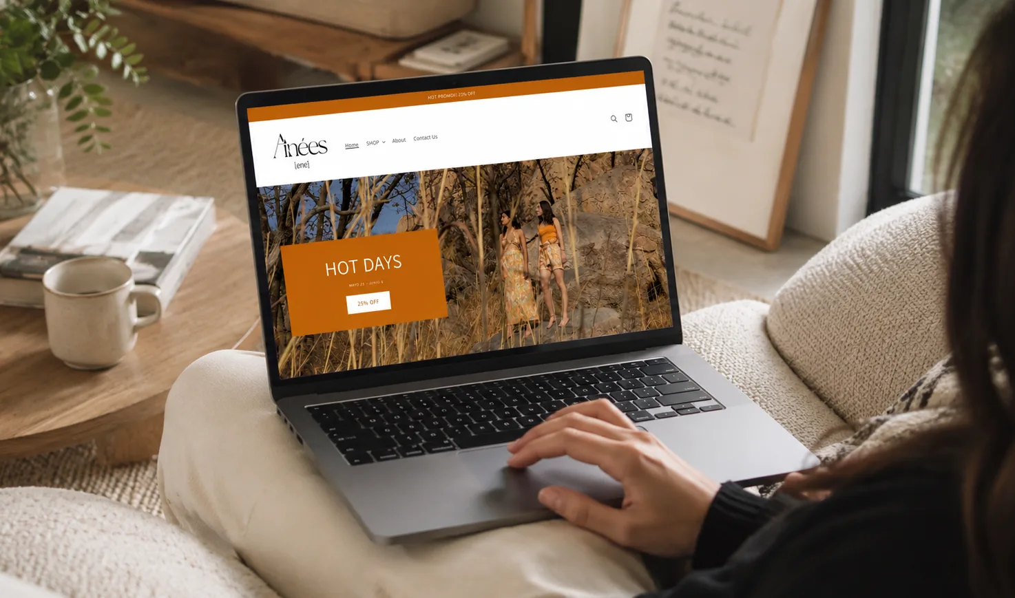
The result became a real product system: sold through its own website, shipped internationally, and presented in multiple design bazaars.
INSIDE THE IDENTITY SYSTEM
The brand looked soft, warm, and expressive.
The system behind it had to be much more structured.
AÎNÉES brought together naming, logo design, textile development, garment design, photography, packaging, and digital presence. Each element needed to work on its own, but also feel like part of the same world.
The challenge was not only to design beautiful pieces.
It was to create a language that could move across fabric, body, image, and brand.
01. Building the Brand World
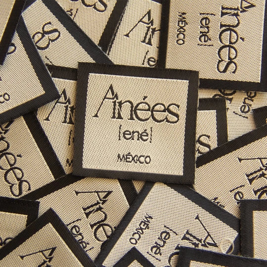
AÎNÉES means "firstborn daughters."
The name came from the identity of the two founders, both firstborn women, and from the mother-daughter relationship behind the brand. It gave the project a personal starting point, but the identity was not designed to feel overly sentimental or nostalgic.
The challenge was to translate that origin into a brand world that felt warm, expressive, and contemporary.
From there, I developed the full identity system: name, logo, slogan, color palette, typography, labels, hang tags, packaging, website, and visual direction.
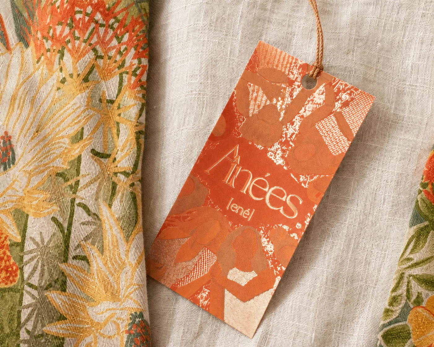
Every touchpoint needed to feel connected. The logo, garments, textiles, tags, photography, packaging, and digital presence all had to speak the same language, even when they appeared in very different contexts.
The goal was to create a brand world that felt personal and emotionally specific, while still refined enough to support a real fashion collection.
The emotional tone lived in the brand voice.
The visual language lived in the textiles, photography, and landscape.
Together, they gave AÎNÉES a voice that felt warm, contemporary, and unmistakably its own.
02. Defining the Garment System
Before developing the textiles, the collection needed a structure.
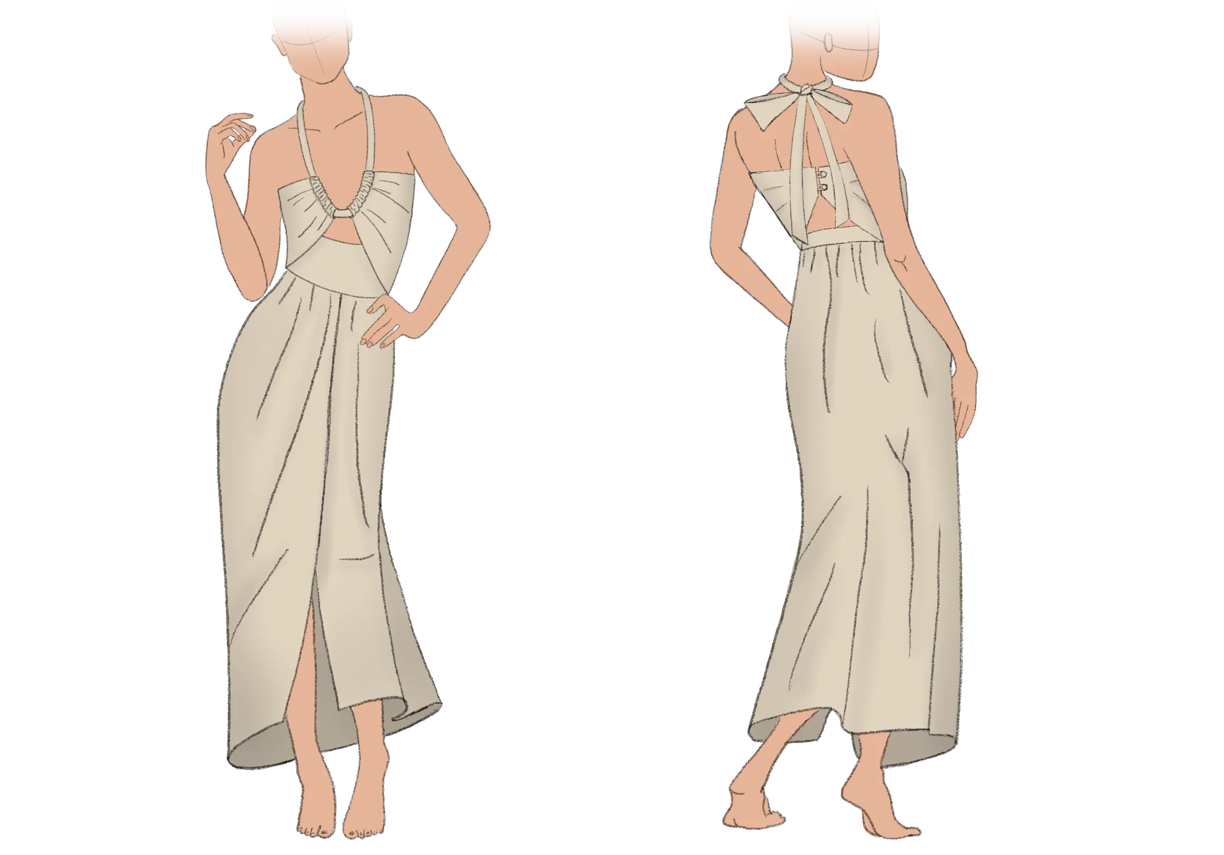
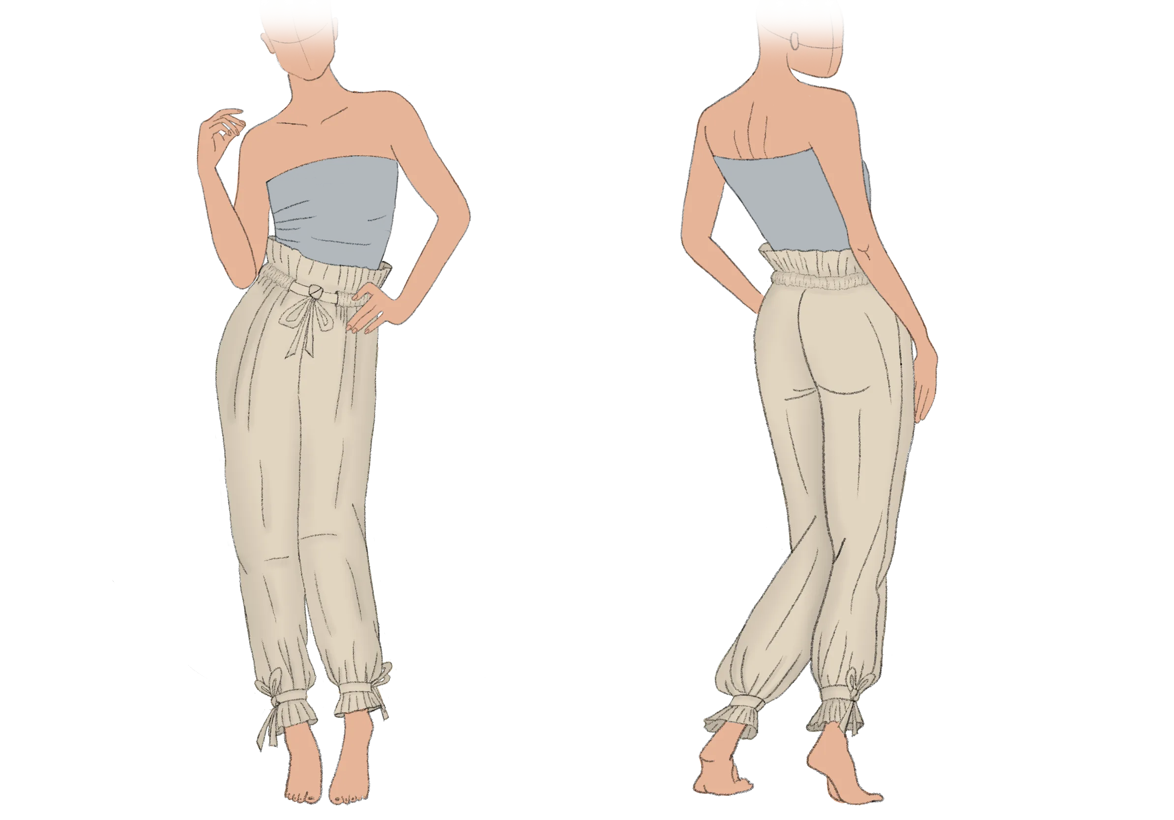
Desértica was built around five garment types: a dress, a top, shorts, trousers, and a blouse. These pieces became the base system of the collection: a small set of silhouettes that could hold different textile expressions while still feeling coherent as one brand.
The garments were designed first, not as isolated pieces, but as a flexible product system.
Each silhouette needed to be simple enough to support different textiles, but distinctive enough to carry the identity of the brand. This became especially important later, when the textile design moved from flat surfaces into pattern pieces, seams, sleeves, ties, waistbands, and movement on the body.
The collection was not built by applying prints to finished garments.
It was built through a conversation between silhouette, textile, material, and production.
FIVE-PIECE GARMENT SYSTEM
The Dress
01
The Trousers
02
The Blouse
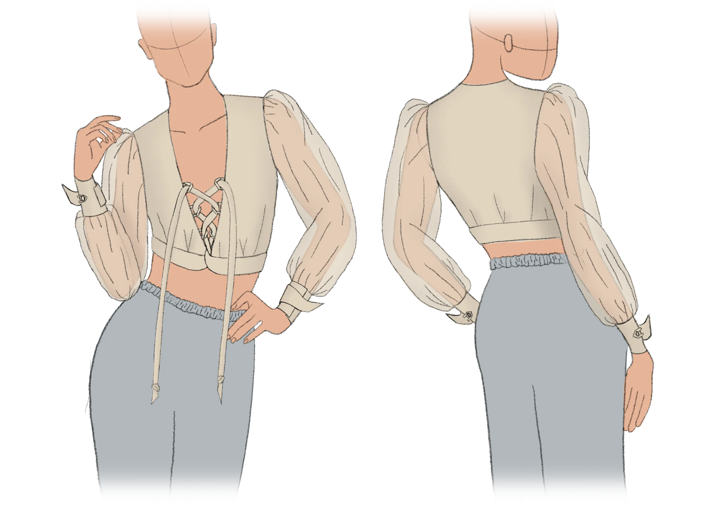
03
The Top
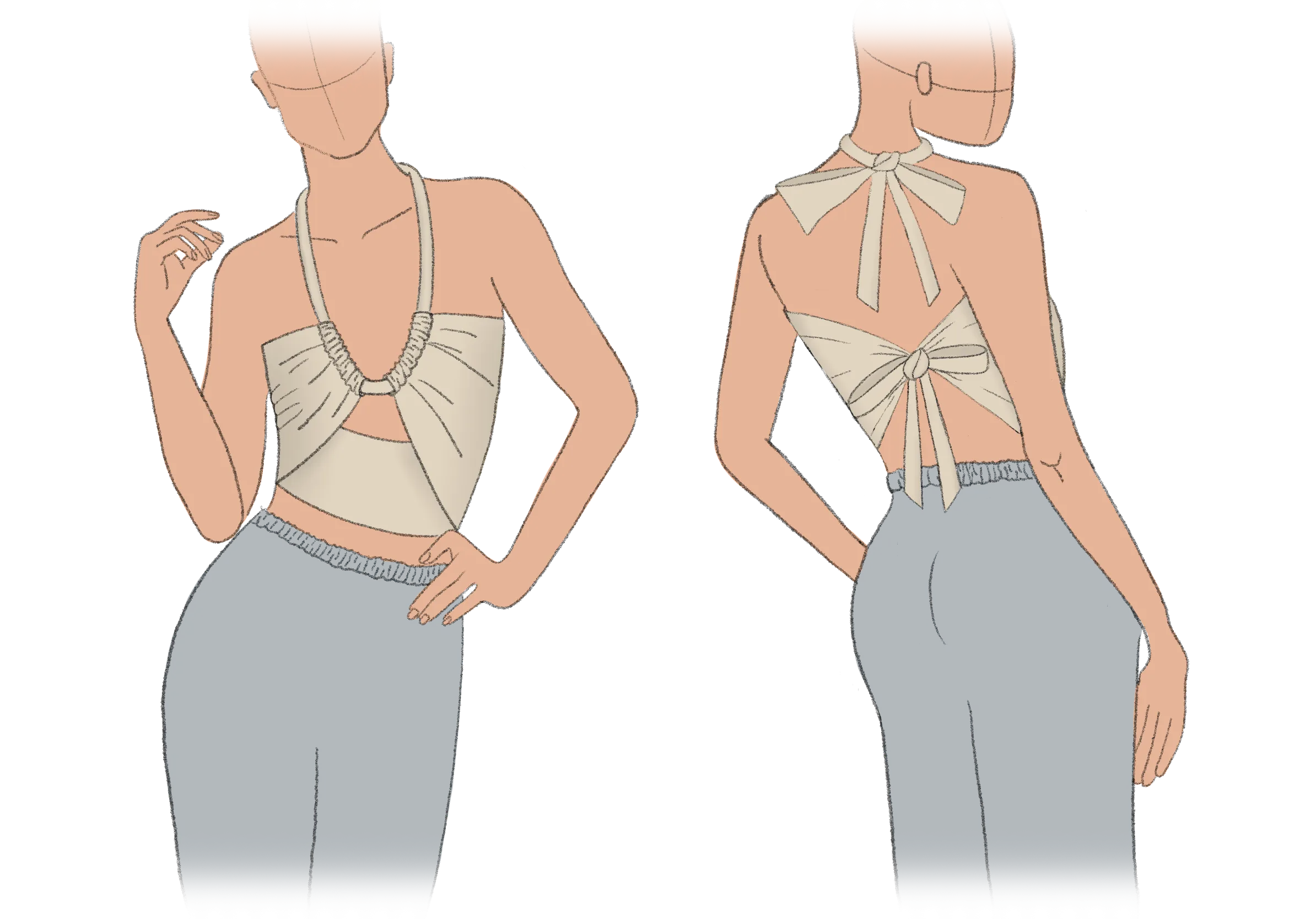
04
The Shorts
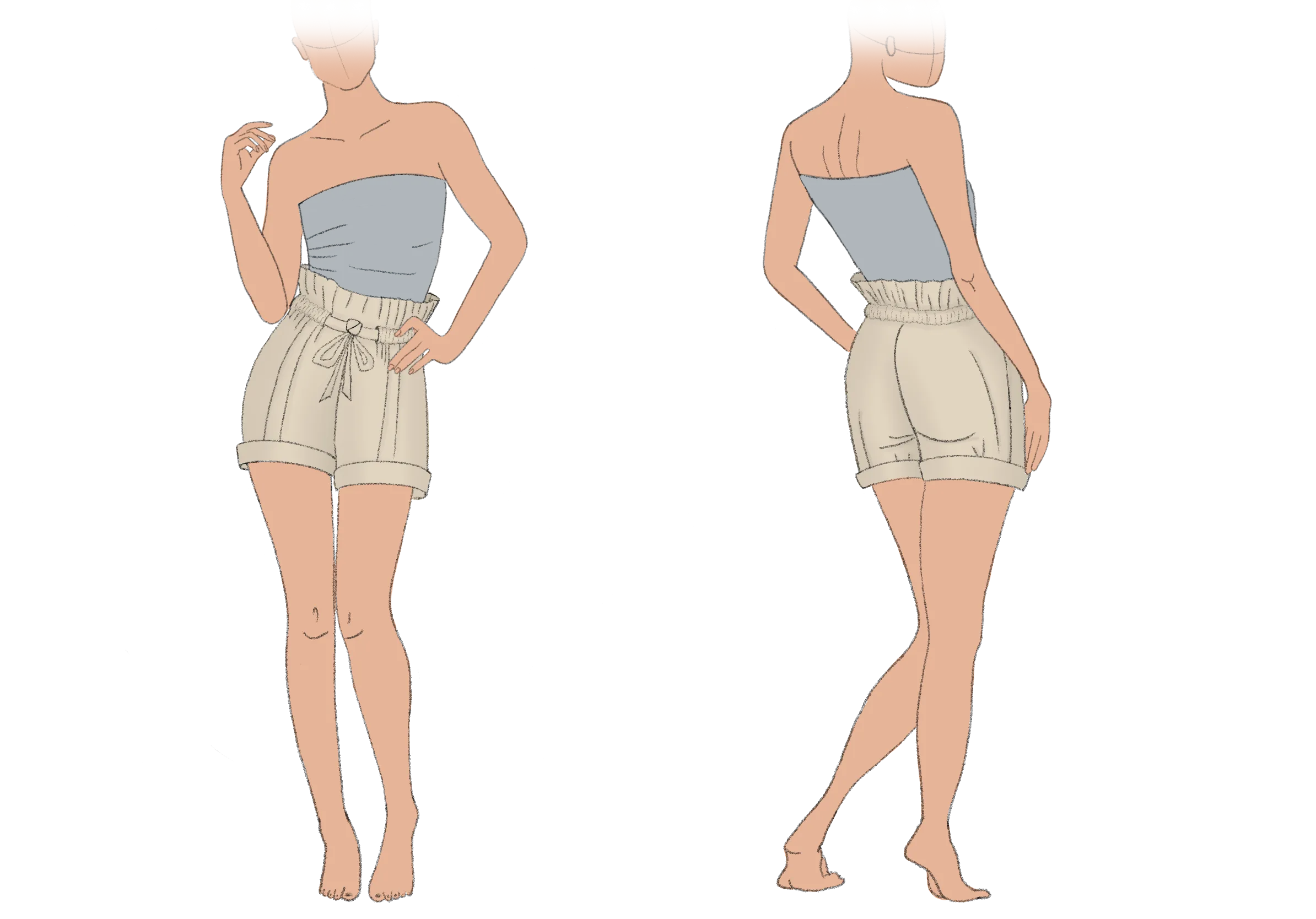
05
03. Textile as the Main Language
Although the garments defined the structure of the collection, the textiles became its main language.
For Desértica, I developed three textile directions: Atacama, Ocaso, and Arena. Each one gave the same garment system a different emotional and visual quality.
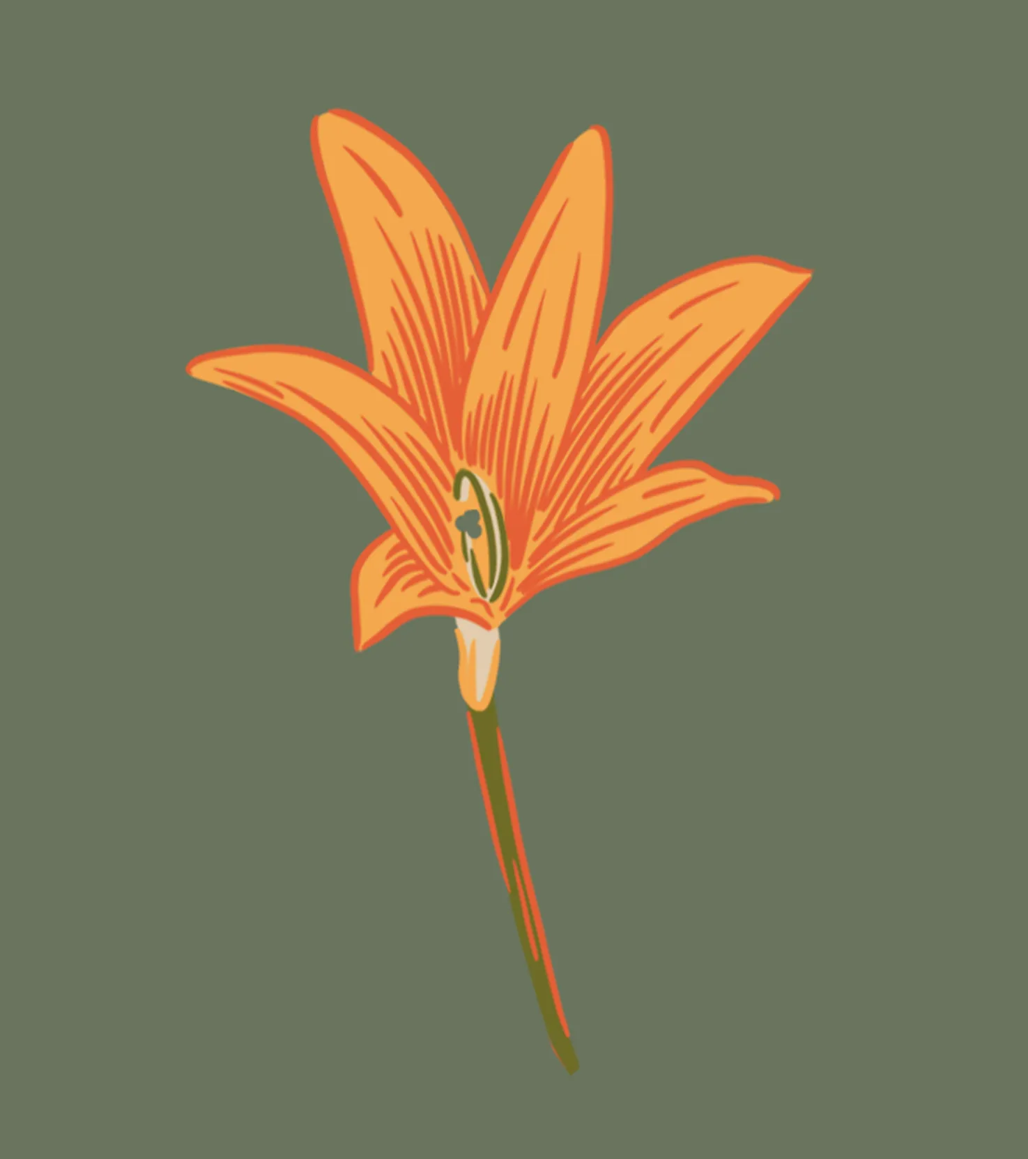
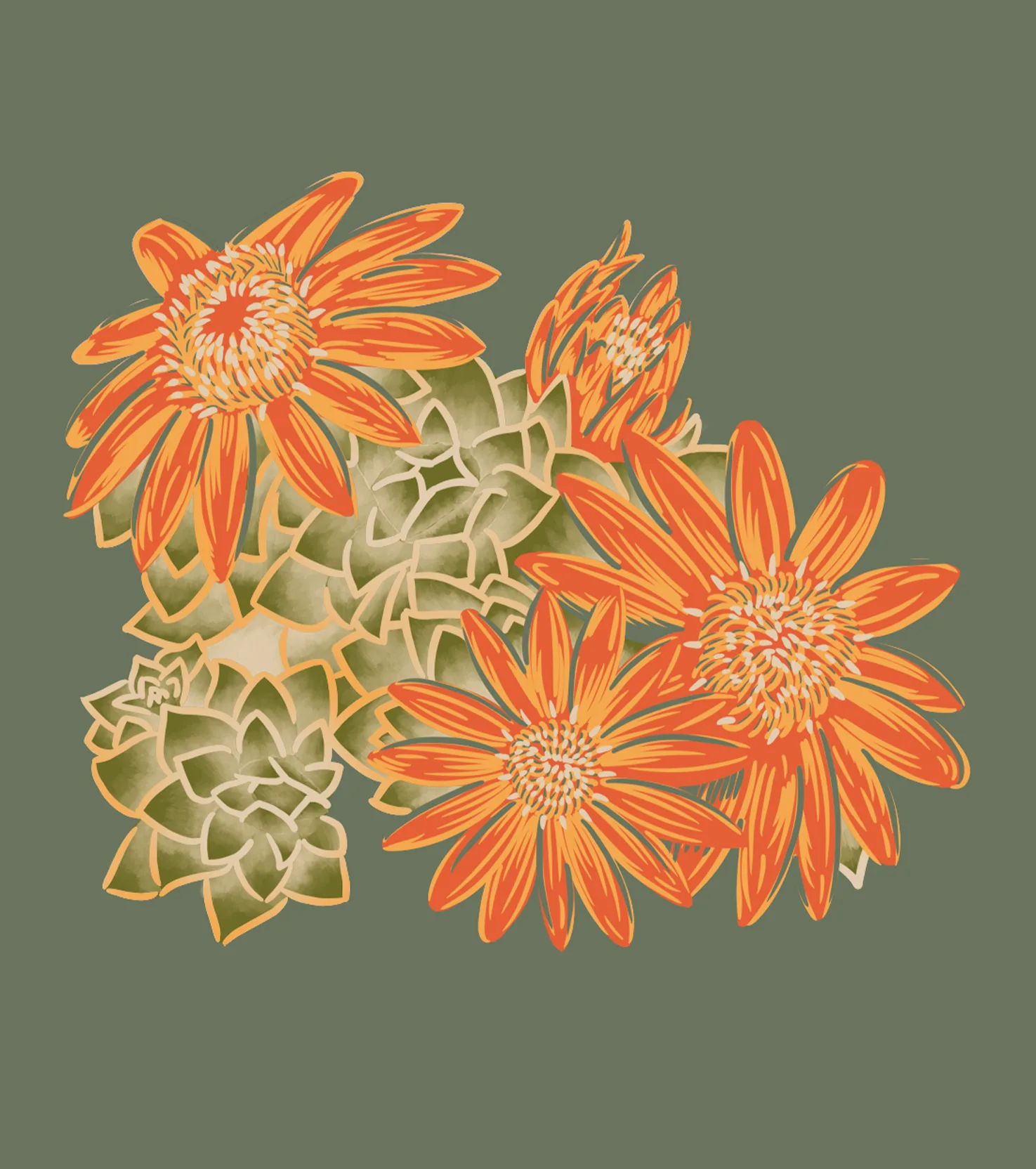
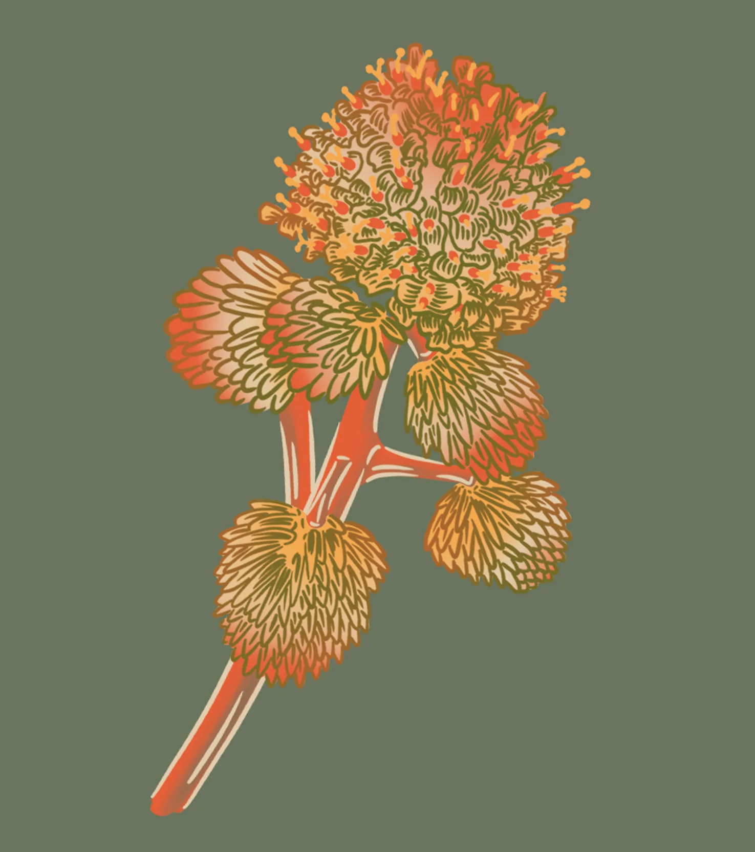
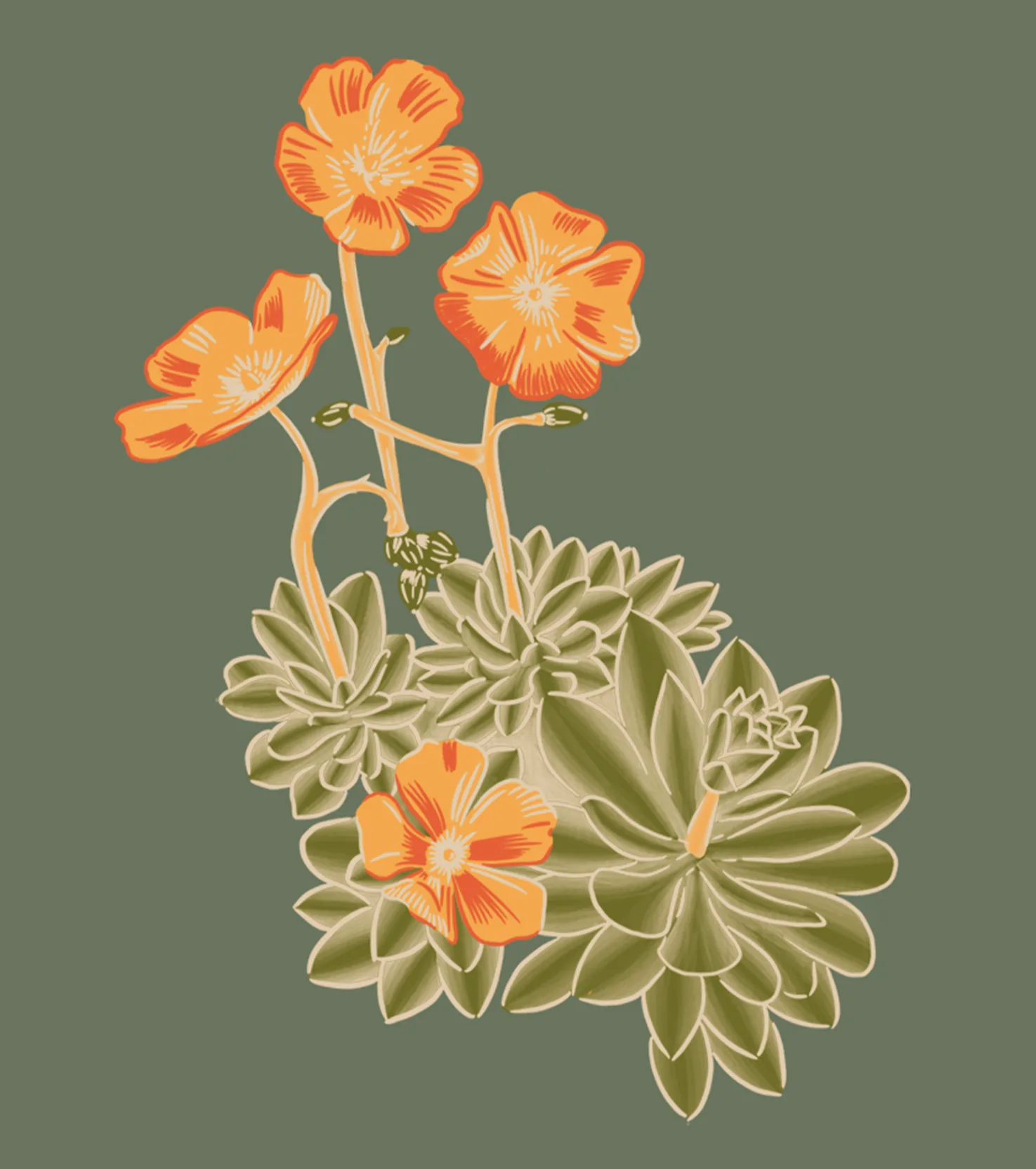
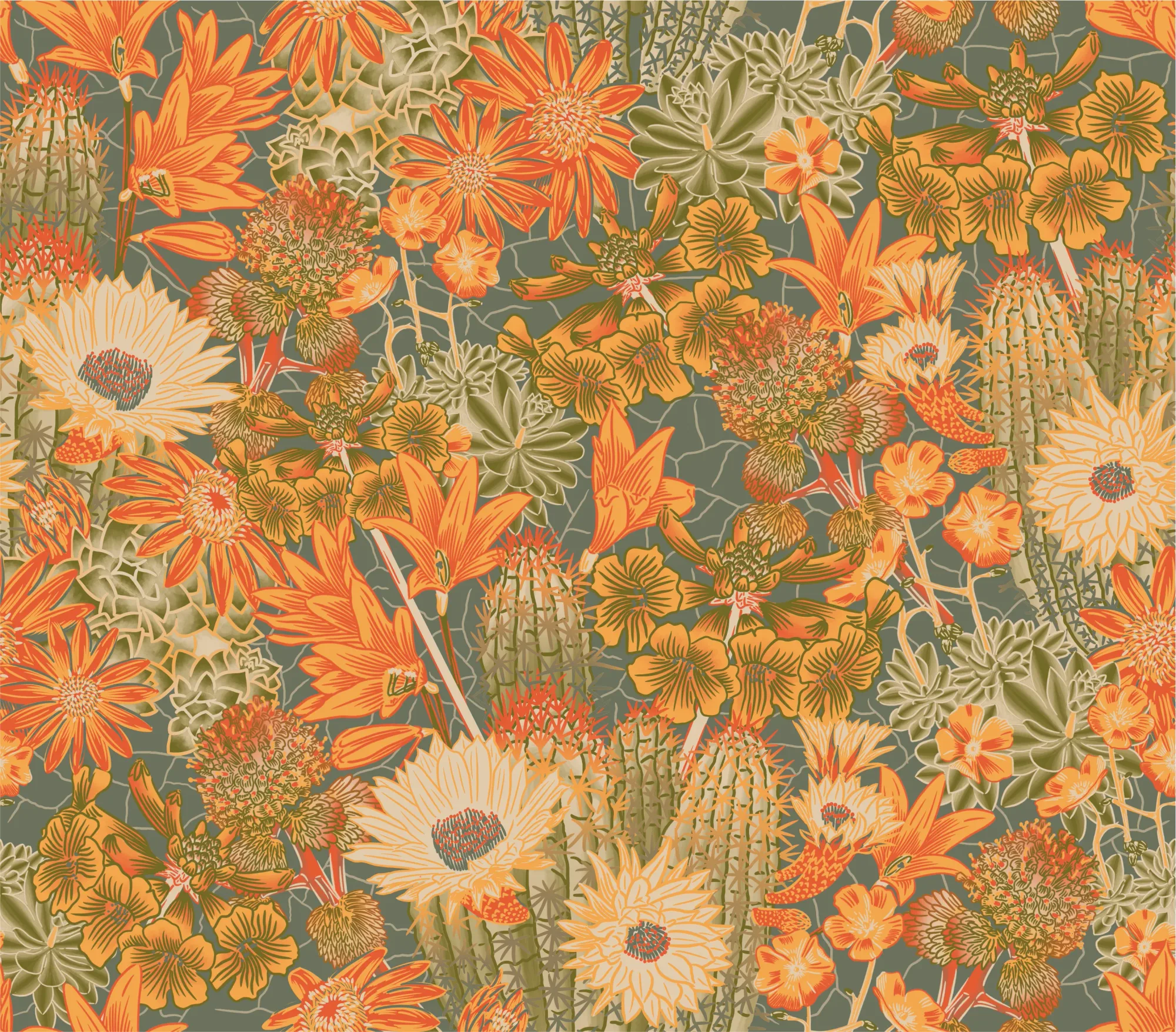
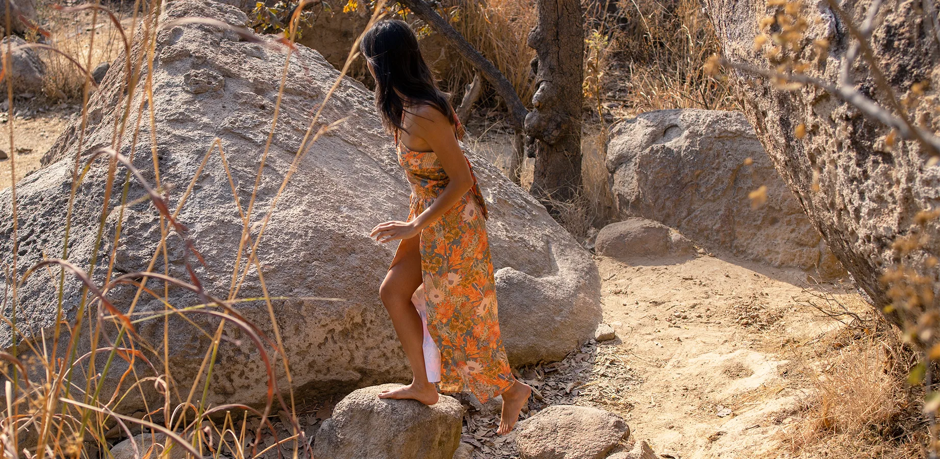
Atacama translated the desert through botanical detail: illustrated species, flowers, cacti, and organic forms arranged into a dense continuous print.
BOTANICAL LIBRARY
Quisco
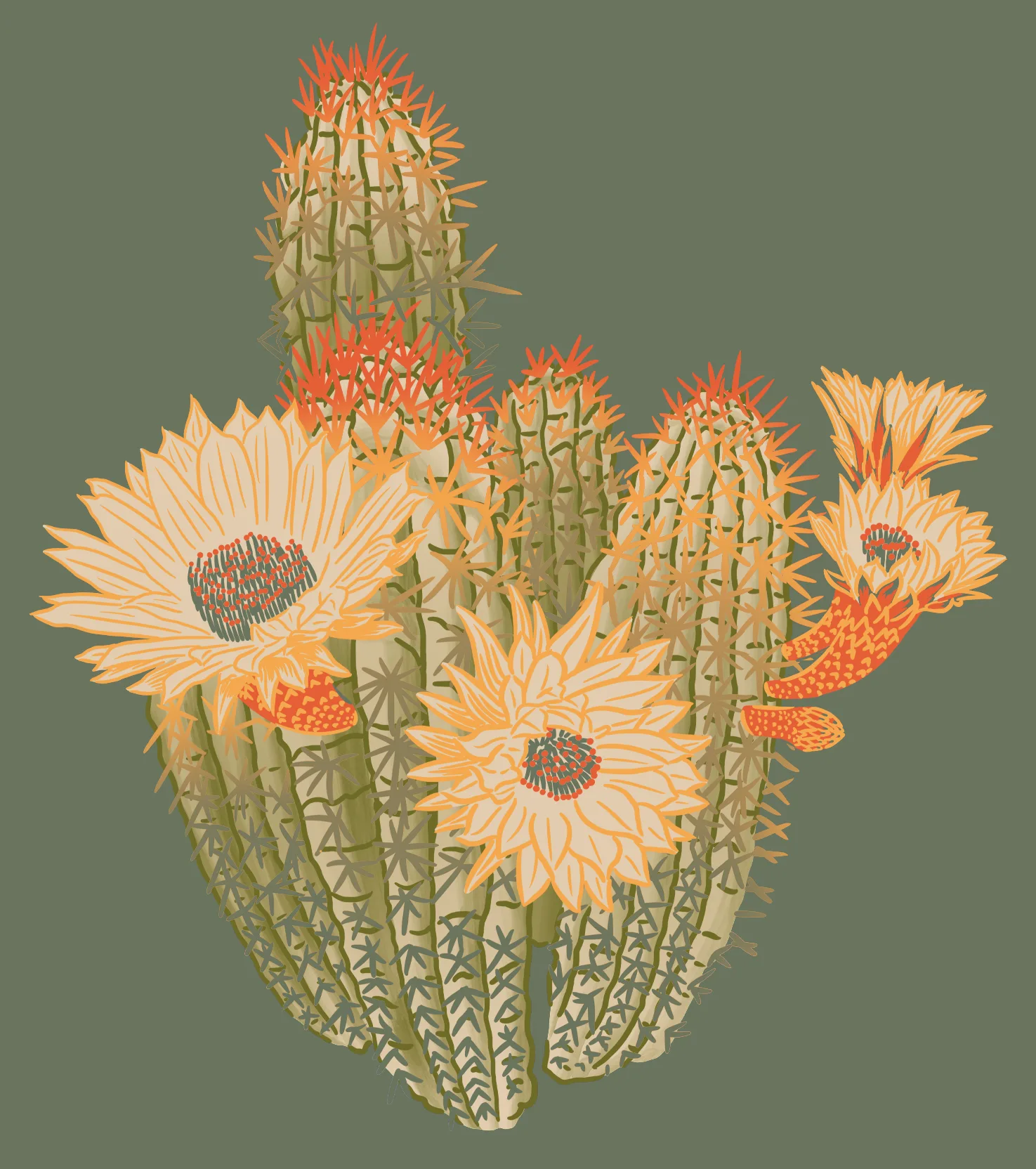
01
Añuñuca
02
Chinita
03
Borlon
04
Guanaco
05
Jote
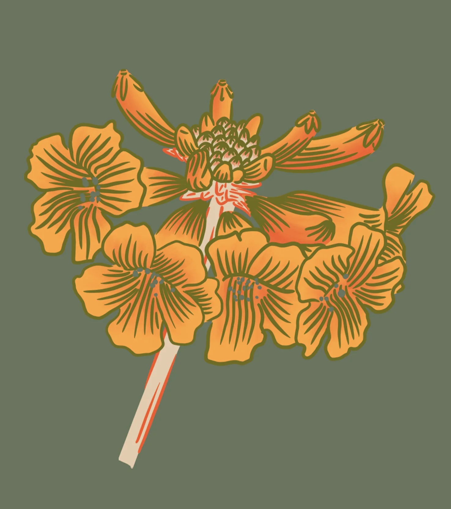
06
A PATTERN WITHOUT EDGES
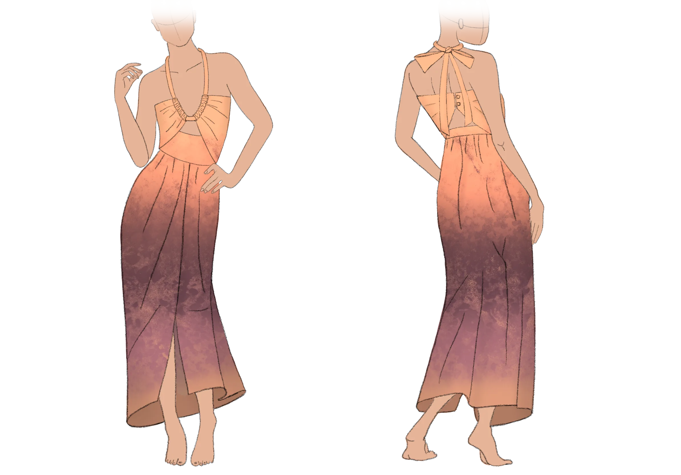
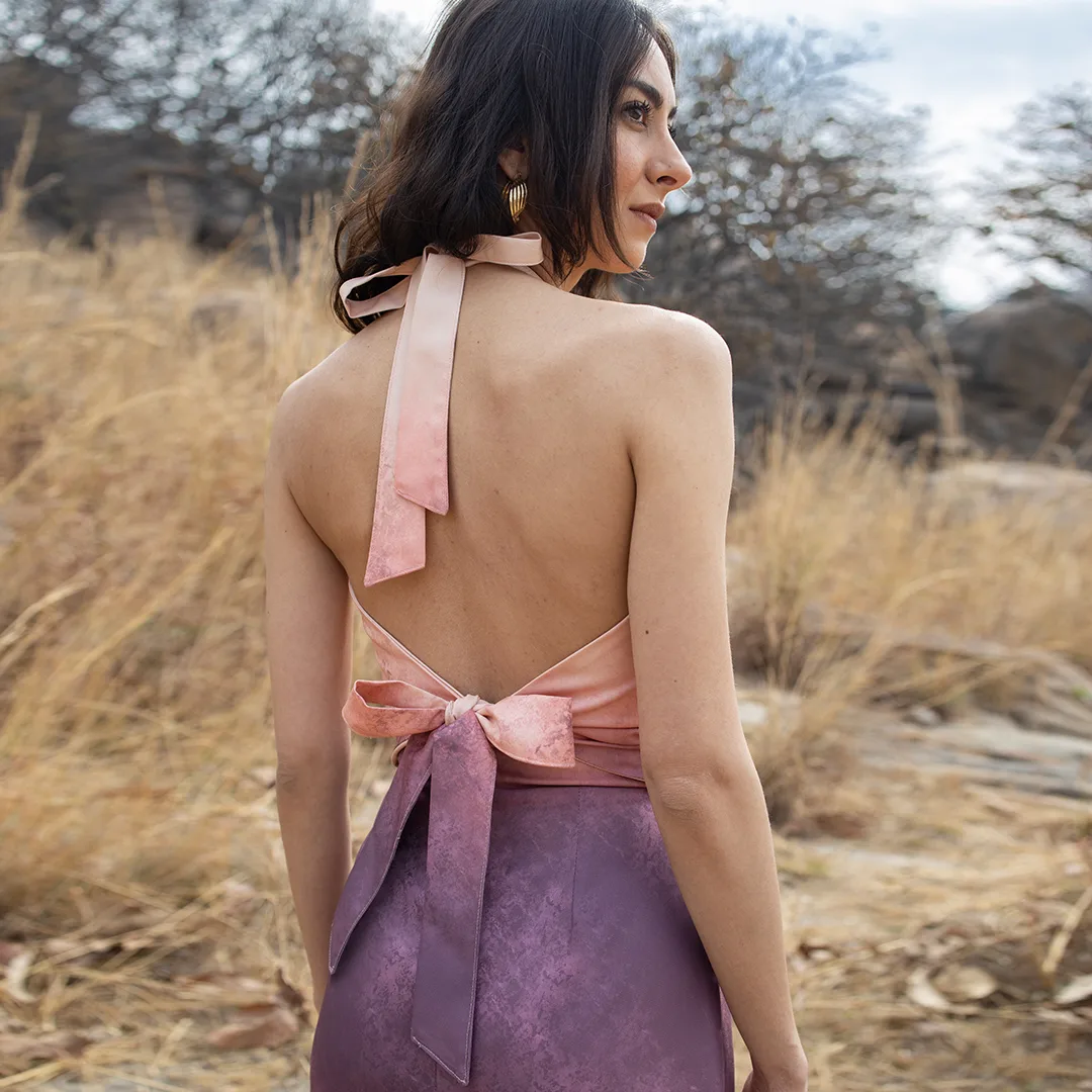
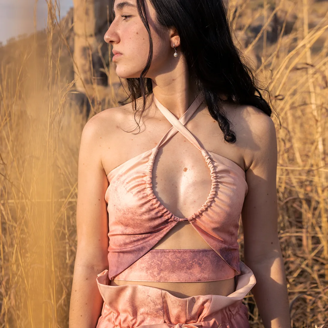
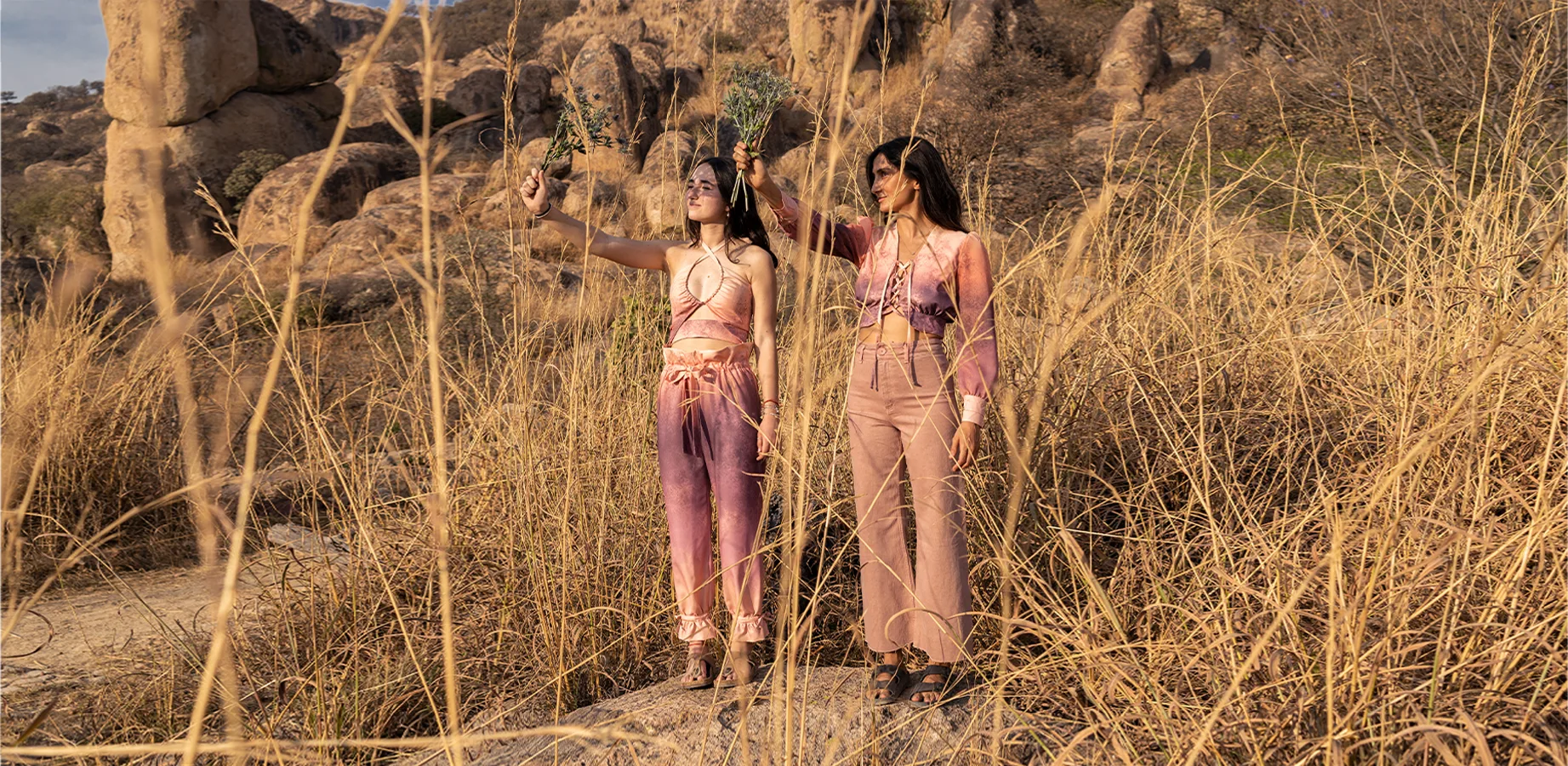
Ocaso translated the desert through light. Unlike Atacama, it could not be designed only as a flat textile. Its gradient had to be developed in relation to the garment pieces, so the color transitions would move intentionally across the body.
Gradient on the Body
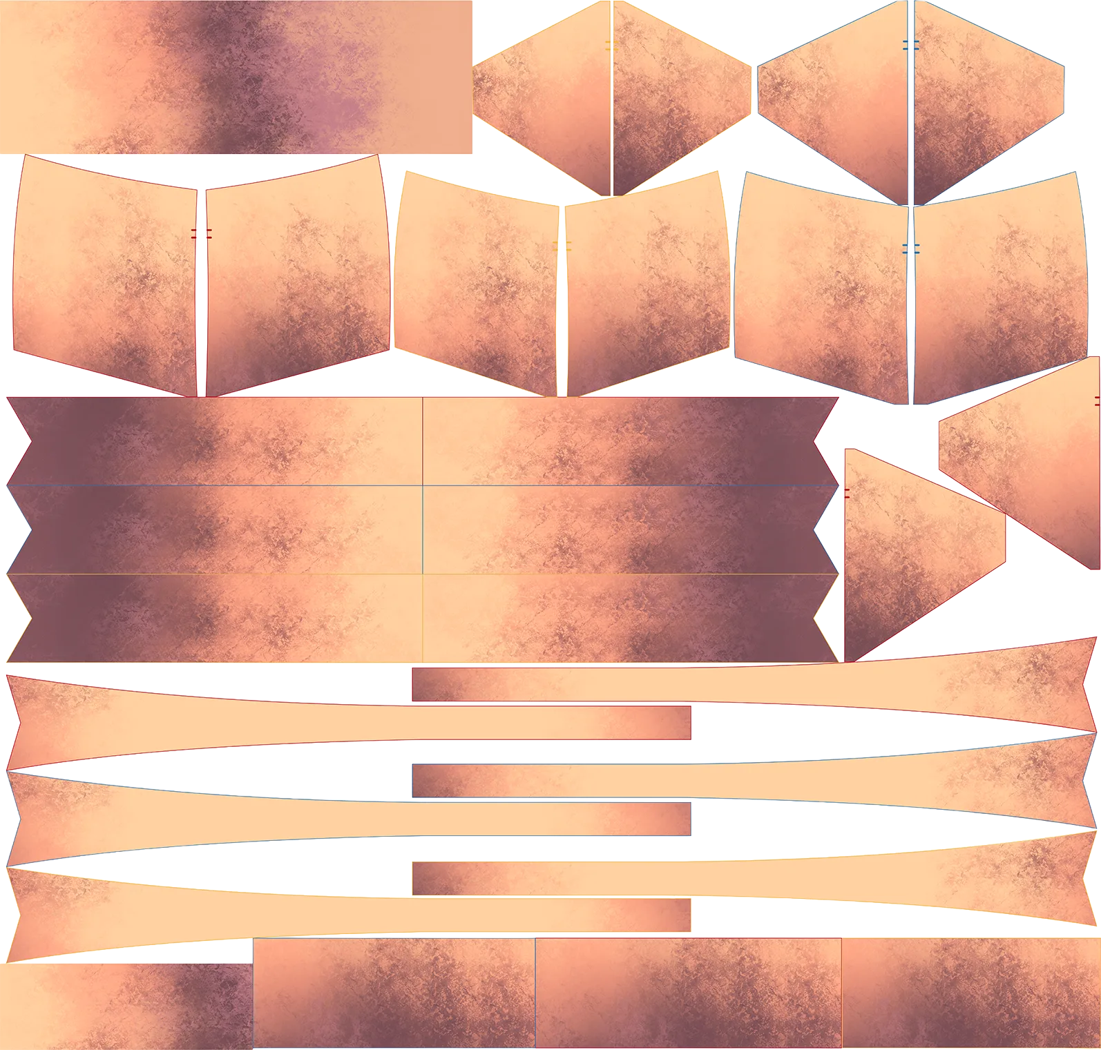
Gradient Mapping
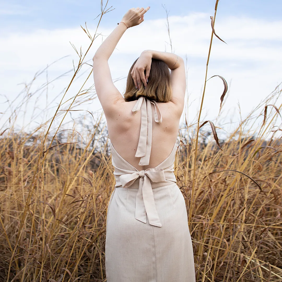
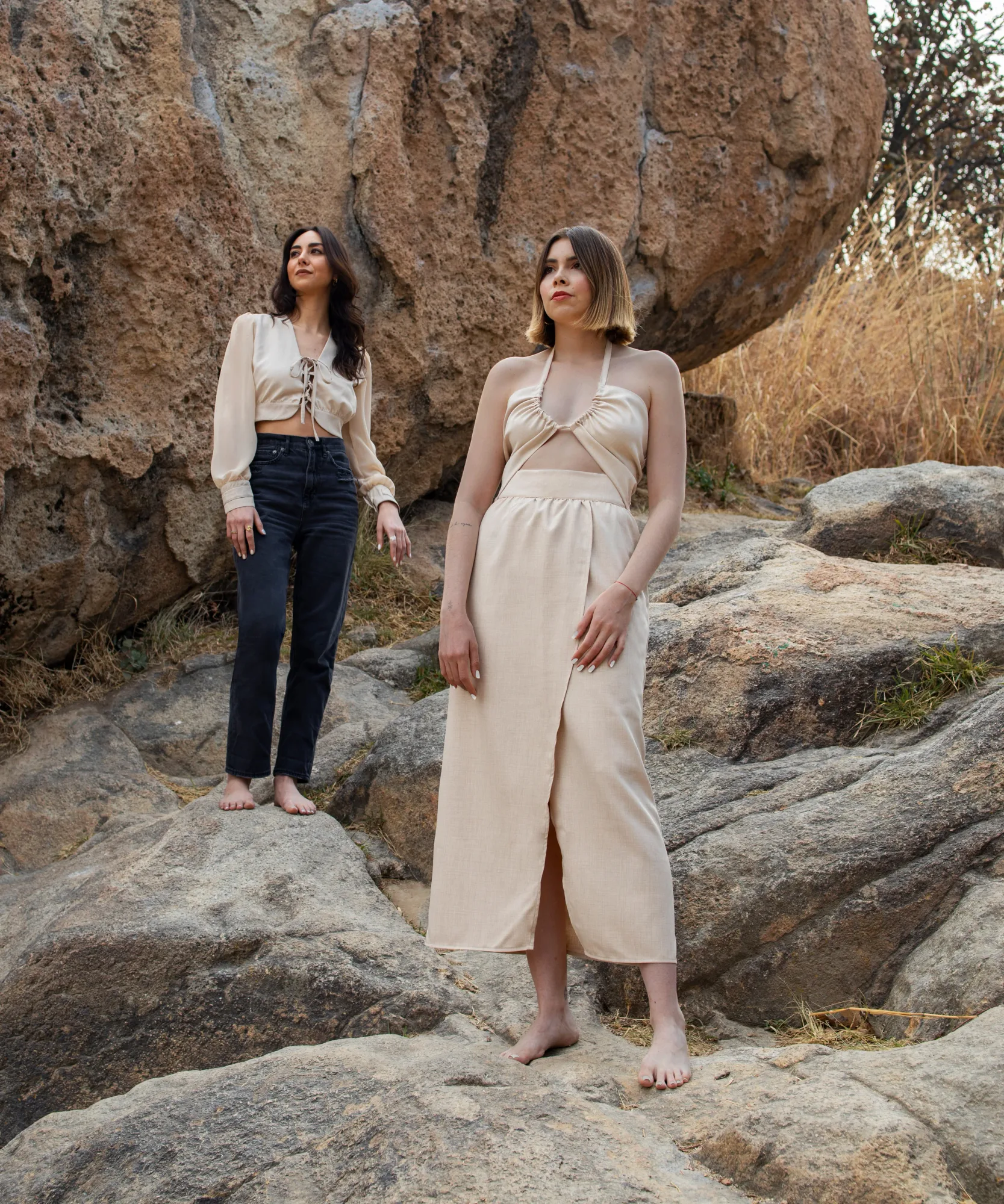
Arena worked as the quiet base of the collection: a solid sand-toned textile that balanced the more expressive pieces and gave the system breathing room.
Together, they formed a small textile system with three distinct roles:
detail, atmosphere, and silence.
The garments created the structure.
The textiles gave it voice.
THE COLLECTION
The collection became the place where the identity system had to become real.
Not as a moodboard.
Not as a flat textile.
As garments that could be cut, sewn, worn, photographed, sold, and repeated.
Desértica was developed across five garments each available in three textile directions: Atacama, Ocaso, and Arena.
This created a flexible product system where the same silhouettes could shift in mood while still belonging to the same brand world.
01. Production & Material Testing
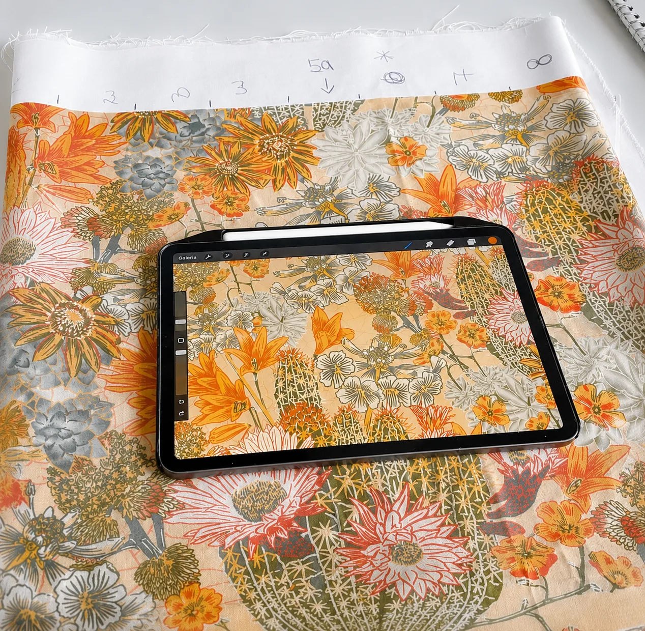
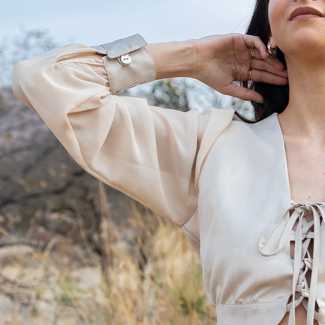
The collection was produced through sublimation on a synthetic fabric selected to feel as close as possible to linen while still working with the printing process.
That constraint shaped many decisions. Color, texture, opacity, fabric behavior, and construction all had to be tested in relation to the final garments.
The process required translating digital color into physical fabric, knowing that the result would change depending on material, print method, and garment construction.
One of the most demanding pieces was the blouse. Its sleeves used a different fabric from the body, which meant the sublimated colors did not behave in exactly the same way across both materials. Several tests were needed to align the tones and make the final piece feel coherent.
This part of the project made the system tangible.
It was no longer only about visual direction. It became a negotiation between design intention, material behavior, production limits, and garment construction.
02. Atacama: Botanical Surface
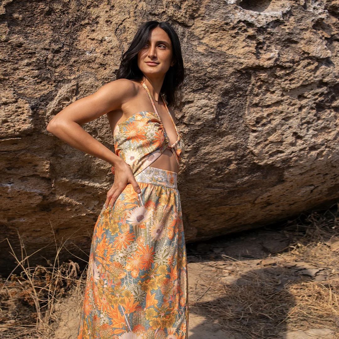
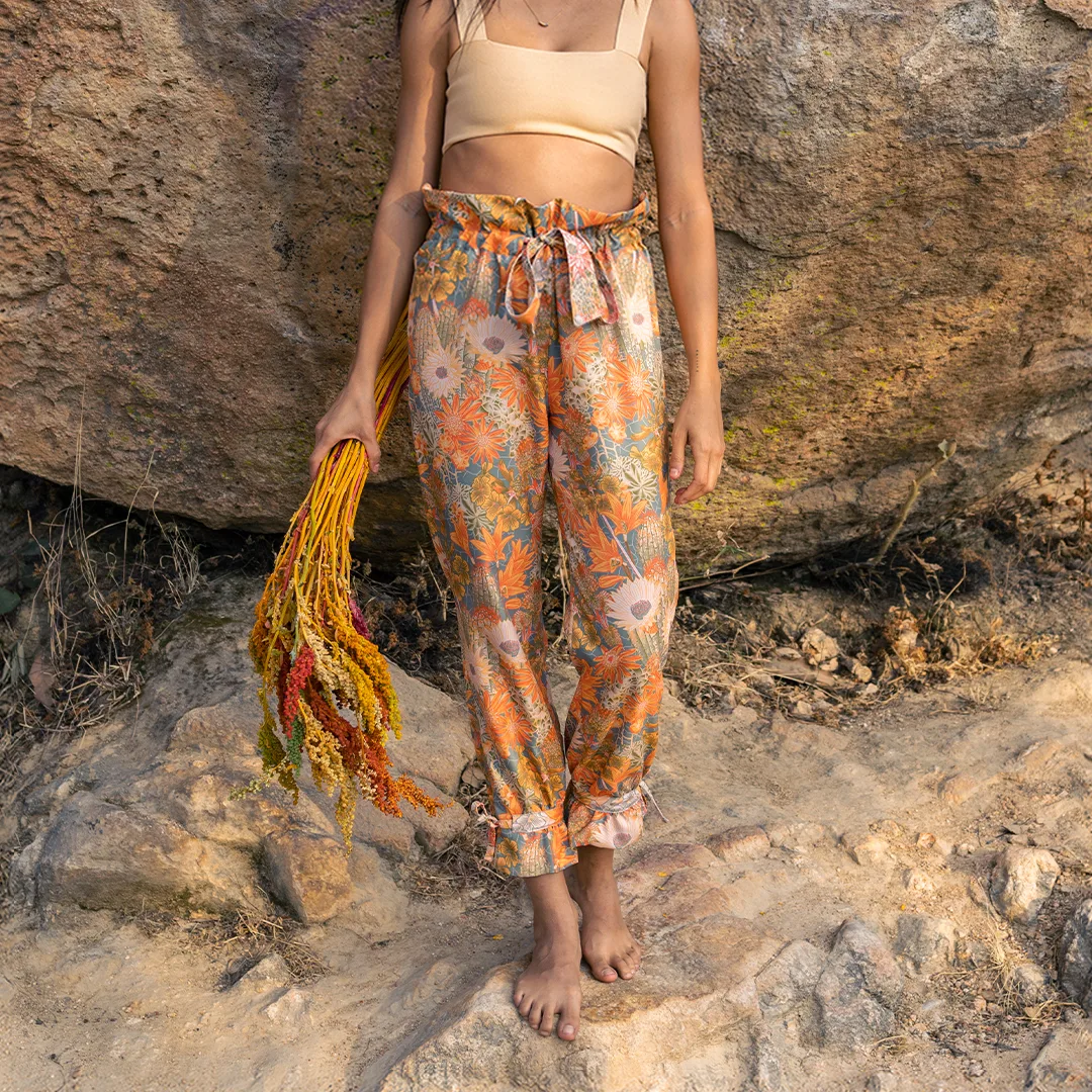
Atacama became the most detailed and expressive direction of the collection.
Its botanical print brought density, movement, and visual richness to the garments. Because the textile carried so much information, the challenge was to let the print feel abundant without overwhelming the silhouette.
On the body, Atacama shifted between two scales: from a distance, it read as a continuous botanical surface; up close, it revealed individual species, flowers, cacti, and organic details.
It gave Desértica its most intricate voice.

03. Ocaso: Gradient Built Through Garment Pieces
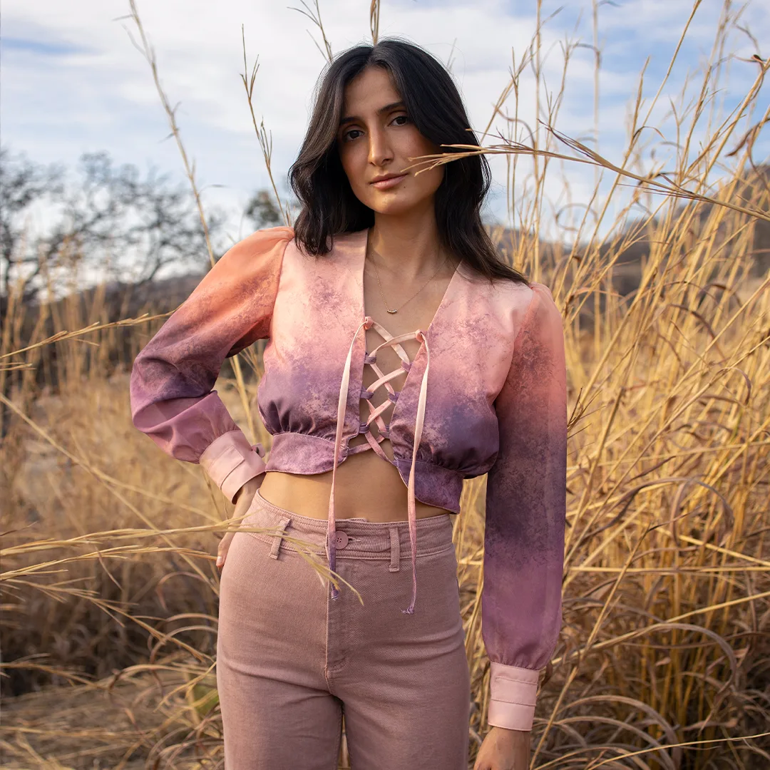
Ocaso was the most technically specific textile direction.
Unlike Atacama, it could not be designed as a flat print and then applied to the collection. Its gradient had to be built through the garment pieces themselves.
The intention was simple: once assembled, each garment should feel like one continuous atmosphere of color moving across the body.
Getting there was more complex.
The gradient had to be mapped in relation to each silhouette: where the fabric would be cut, where seams would interrupt the surface, where pieces would reconnect, and how the color would continue across the body once the garment was worn.
Even the ties were designed into the gradient logic. Their placement considered the length they would take once tied into bows, so the transition would continue through the fastening points instead of visually breaking.
This made Ocaso less like a textile applied to a garment and more like a textile built through construction.
The gradient did not sit on top of the garment.
It belonged to it.
04. Arena: The Quiet Base
Arena was the quietest direction in the collection.
As a solid sand-toned textile, it created balance inside the system. It gave the silhouettes a calmer expression and allowed the printed pieces to stand out without making the collection feel visually crowded.
It also made the product range more wearable and complete.
If Atacama carried detail, and Ocaso carried atmosphere, Arena carried silence.
05. Art Direction
Once the garments existed, the final challenge was to present them as part of the same world.
The campaign was not treated as a separate photoshoot. It was an extension of the identity system.
The art direction brought together location, styling, props, shot direction, and production coordination. Each decision was made to connect the garments back to the atmosphere that shaped the collection: desert landscapes, warm light, dry textures, natural shadows, and a sense of softness grounded in place.
The models' styling, accessories, poses, and props were designed to support the textiles, not overpower them.
That same visual language extended into the website, product imagery, packaging, labels, and physical selling environments.
AÎNÉES needed to feel coherent from the first image to the final garment detail.
From landscape to textile.
From textile to body.
From body to brand.
Reflection
AÎNÉES helped me understand how much of identity design happens beyond the logo.
A brand becomes real through repetition, materiality, photography, tone, texture, production details, and the small moments where people encounter it. In this project, the identity had to live inside garments, printed textiles, labels, packaging, images, digital interfaces, and physical selling environments.
That complexity is what made it interesting.
The project brought together many parts of my practice: industrial design, fashion, textile development, art direction, branding, and digital storytelling. Looking back, what matters most is not that the outputs belonged to different categories, but that they were designed to belong to the same system.
It also taught me that coherence is not about making everything look the same. It is about creating enough structure for different expressions to still feel connected.
Atacama, Ocaso, and Arena each carried a different mood, but they belonged to the same world. The garments, labels, campaign, website, and selling experience all had different roles, but they were part of one identity.
For me, AÎNÉES is a project about building coherence across many forms.
A visual world made wearable.
Credits
Pattern Development & Garment Production
Cecilia Prince
Campaign Photography
Sofía Carballo